


Building a Design System As a Product with Atomic Design Approach
Duration:
3 months (2023)
Team:
4 UX Specialists at Pratt Institute’s DX Center
My Roles:
Deconstructing current website design;
Identifying visual principles & guidelines;
Standardized components and the UI kits;
Building UI components of the design system;
Documenting and branding the design system.
Project Overview:
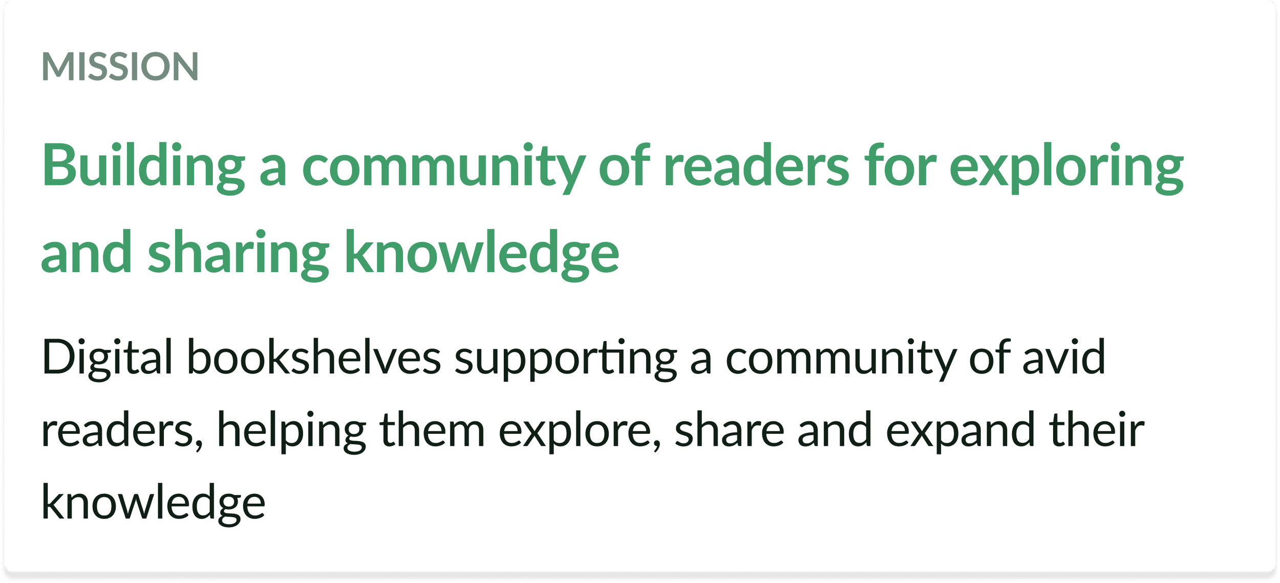
Goodreads is a social cataloging website that allows readers to organize their digital bookshelves, connect with one another, rate and review books, and track their reading. Building a consistent, clear, and familiar design system, not only enhances the consistency of the Goodreads website, but also assists designers, product managers, and engineers in improving the user experience.
Why do we need design systems?
Every new hire and every new project increases chaos in the process and slows down velocity. The business requirements pressure designers to build more, faster, and better. Design systems help in establishing standards, to ease the onboarding process and accelerate ongoing projects.
“Design system is a scalable framework of decisions & team behaviors across a product portfolio to converge on a cohesive experience.”

Our Initial High-level Goals
Created to address the lack of consistency and form a cohesive experience across the Goodreads site, the Storyteller Design System provides a framework for designers and developers to create and maintain the user interface more efficiently, enabling 3rd parties to use our design system and extend our ecosystem.


What was the challenge?
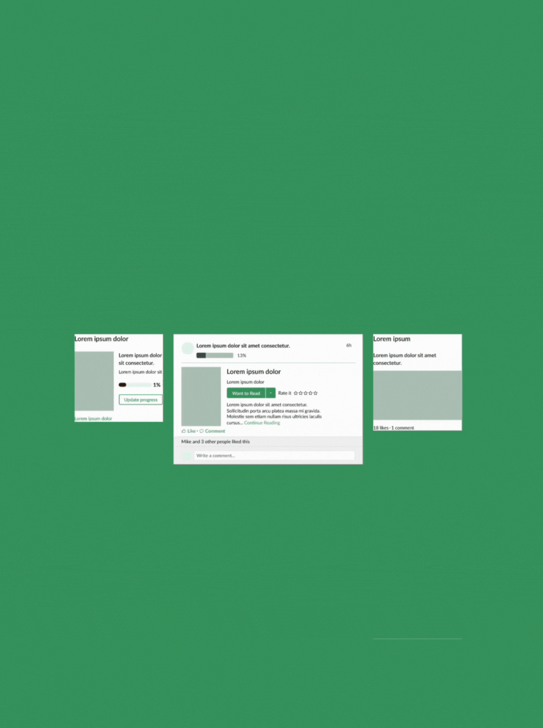
During our analysis, we found that the Goodreads website lacked consistency and coherence, resulting in a disjointed user experience:
12 different button styles;
26 different fonts and sizes;
Duplication of common components;
Inconsistencies across the Home page and micro-sites.


Deconstructing Current Website
To identify patterns and inconsistencies in how those elements were used, we cataloged every distinct style and component that make up the Goodreads site's interface.
By reviewing all the different treatments of each component, we gained a holistic view of the site's design and identified opportunities for improvement.
Identifying the Design Values
Drawing from Goodreads' company values, we identified multiple themes. After categorizing these themes, we pinpointed the primary value area where the majority of them converged.


Our Key Design Principles & Values

Structuring the Design System
Atomic Design Approach
Using the Atomic Design approach allowed us to create a consistent and scalable design system that can easily be updated and adapted to different contexts and needs.
Foundations - Grids & Spacings
I ensured guiding grids and spacings for consistency, scalability and responsive design.
Incorporates spacings to add depth and visual hierarchy to UI elements such as buttons, cards, and modals;
Grids for desktop and mobile screen sizes based on multiples of 8 for consistent spacing.

Foundations - Color & Typography
I defined a unified color palette and typefaces to create a consistent look across the site.
The primary green color from goodreads.com was retained, accompanied by a scalable color scale for flexibility and visual hierarchy. We followed WCAG 2.1 guidelines to ensure good color contrast.
Building the Design System
2.Molecules
Then, 2+ different atoms formed cohesive groups that function individually as a unit.
4.Template & Page
At last, we assembled various organisms, establishing a consistent template across diverse web pages.
1.Atoms
First, we agreed a system of reusable basic building blocks.
Based on the definition of Atoms in Atomic Design Methodology, an atom has one function and can’t be broken down any further without ceasing to be functional.
3.Organisms
Combine 2+ different atoms or molecules to chieve functionality.


Guidelines template
defined spacing and layout rules across the interface to create balance and hierarchy.
Highlights of Design
What Design Technologies were Used?


Auto Layouts
were employed to improve responsiveness by setting constraints and rules for component behavior across various screen sizes and devices.

Components & Properties
to ensure consistent appearance and behavior, such as size, color, and icons on a button; components were built using variants, allowing for different styles and functionalities based on context, for example, disabled or hover states for buttons.
Applying the Design System
The Storyteller Design System library is accessible in the Figma community, giving easy access for designers and boosting the integration of the design system.


Documentation resources for using the design system including onboarding guides, accessibility standards, contributions, etc are created and maintained via Zero height. We ensured that it’s been organized in a conventional structure utilization to enable a seamless navigation to developers, designers, and relevant stakeholders.


Takeaways


Looking back at the successes and the losses, we learned some valuable lessons:
Design systems are ever-evolving. They are living systems that require a dedicated team actively iterated in their growth and maintenance. Facilitating adoption and cross-team buy-in is a challenge worth undertaking that ensures we all are presenting a common design language, that is familiar and consistent for any person interacting with it.
Accessibility is MVP. Defining accessibility requirements and getting buy-in at all levels of the organization from the beginning will directly impact those difficult feature and enhancement conversations later down the line.
Next Steps

For the future steps, we will work on incorporating design tokens for better collaboration with developers.
While we had big plans for Storyteller and it's continued growth and expansion for even more potential library. Governance and documentation is hoping to be more thoroughly laid out so that adoption of this system can be picked up by any team moving forward.