Mobile app core experience redesign for cooking learning platform
Duration:
8 Months
My Role:
Product Designer
My Team:
1 User Researcher, 1 PM, 1 Content Writer, 5 Developers
Tools:
Figma, Jira, Amplitude, Miro, Procreate, Photoshop, Illustrator, Adobe Effects
My Responsbilities:
UXUI - User story, Wireframing, Prototyping, Mockups, Design QA
Product Vision - Competitive Analysis, User Research & Interviews, UX Roadmap Management
Others - Leveraging & restructuring the existing design system, Badge Design, Illustration


✱ 30,000 downloads and 6,000 accounts created since Parsnip iOS has been launched (7 months)
Problem
Parsnip has seen users drop off before completing sign-up,
this was threatening their business.
Challenge
To figure our the root reasons of user drop off, increase the returning users, and raise the conversion rate.
Results as of 2023.05
✱ Over doubled the user activation rate by implementing onboarding flow, and gamification
✱ Weekly retention consistently around 20–25% as long as 4 months from the first use
✱ 4.9⭐ on iOS with over 300 ratings, with Positive valuable qualitative feedback →


Formulate a curriculum flow that leverages the cooking tech tree, launched MVP design flows.

Design Approach
Adheres to agile development, the reverse double diamond approach ensures a fast-paced iteration balancing business objectives with user-centric experiences.

Conduct user interviews, secondary research, analyzing data to define main problems and user pain points.

I came up with solutions and prioritized them with team, quickly drew wireframs to review and evaluate.

Put the new design ticket to Jira, developer team launch the new design. Start a new round of user testing, and iterating based on quantitative data and qualitative feedback.
Team decide on the best designs, I developed the prototypes and tested with our existing and potential users to decide on which solution that best solved user needs and is the most user-friendly.
01.
Empathize with our user
To thoroughly investigate hidden product challenges and App usability issues, I conducted high-level user interviews after identifying issues through metrics to understand their pain points, and the usability testing to understand the issue in our original app.


Find the gap between their goals and their frustrations on the app.
Insights & Analysis

They want to systematically learn cooking and upgrade their skills ;
They are not confident in kitchen techniques or are frustrated by the procedures.
02.
Findings and takeaways
The biggest challenge with using our app is confusion, motivation, and easy filtering of the content users want to view.
✨ Aha moment -
Want to be confident in kitchen techniques, and less frustrated by the procedures.
Need to save time and money on meals, and want to eating healthy with family


Mapping the experience
Mapping the experience of cooking learner helps to visualize the pain points and the corresponding stage during the journey.
Competitive Research
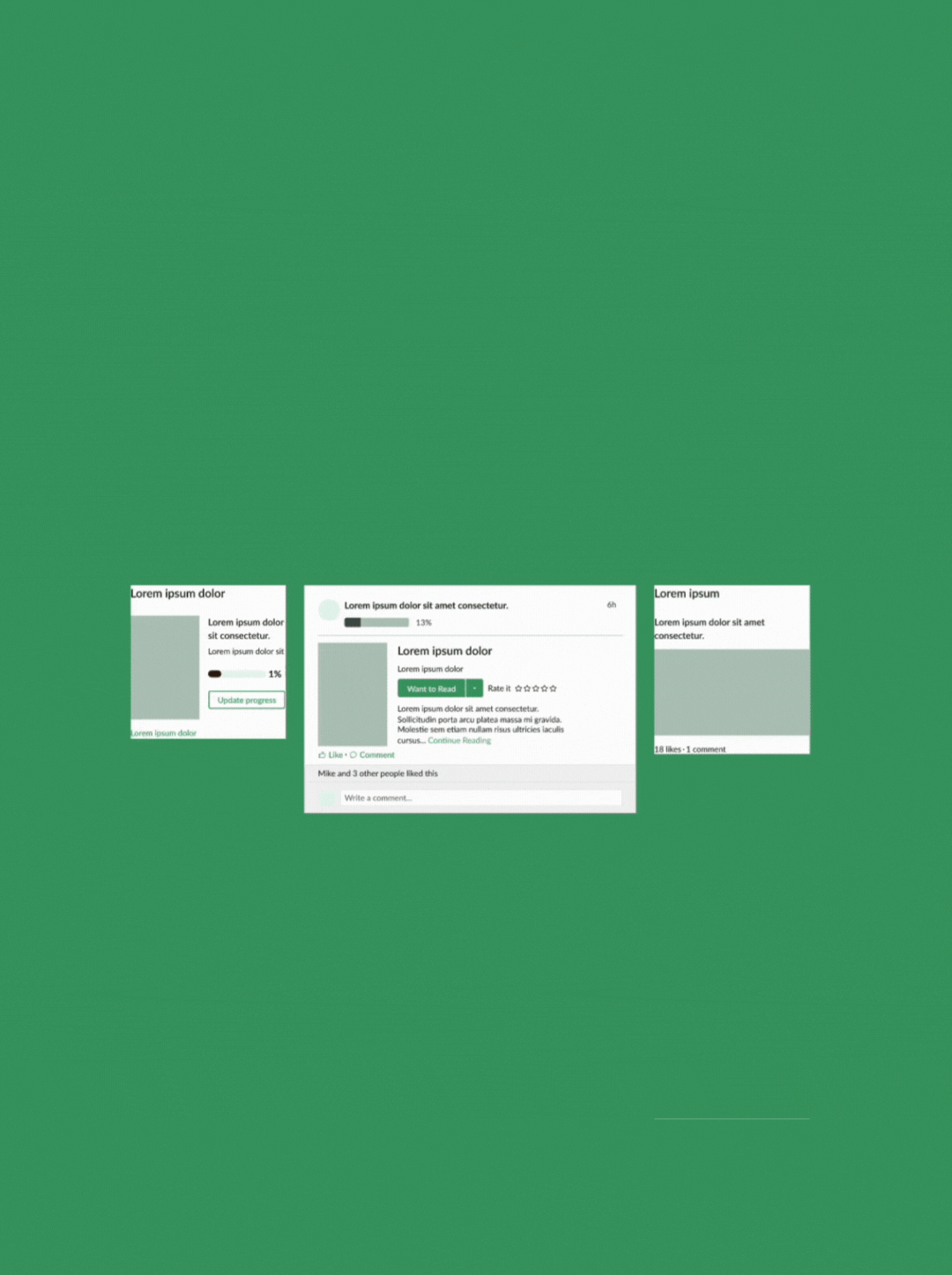
Finding inspiration in how competitors incentivize their users.
The critical functionalities in these apps consist of learning skills, cooking recipes, progress tracking, and an incentive system.
How do we help users get familiar with the app more easily?
How can we highlight app value for users?
💯
🎲
🥘
What’s the best way to navigate through layered recipes?
03.
Identify Design Opportunities
04.
Brainstorming
Keep in mind that communicating to users “You’re doing great and making huge progress.”, multiple ideas that cater to 3 main flows in our app.
1. Sign-up flow
2. Quiz flow
3. Dishes page
1️⃣ Sign - Up Flow
AS-IS
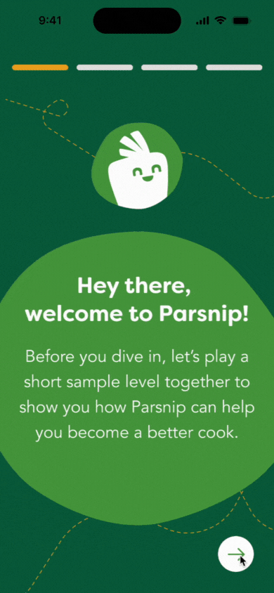
Step 1. User onboarding - Visually Communicate Benefits and Differentiation
Explaining quizzes to help users learn through context and pattern recognition.
Making mistakes is a natural part of the learning process.
Levels played can be applied to multiple quizzes and topics.
Step 2. Select initial dish - Enhance User Awareness and Engagement
They better understand the purpose behind selecting a dish after being guided through the demo quiz.
A notification screen to regularly update users about newly released dishes.
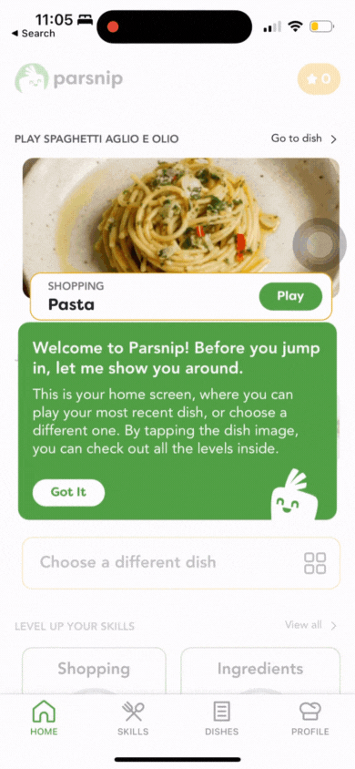
Step 3. Just-In-Time User Guide


This guide helps users quickly understand the app's core functionalities and addresses specific issues as they arise.
05.
Design Solutions
➞
TO-BE
With a sample-level gameplay and active onboarding tips, reduce user confusion from the novel learning approach and quickly familiarize them with the app.

Screen-by-screen sample level demonstrations


Final Design - Clickable Prototype
The final version consists of refined sample-level gameplay and active onboarding tips, reducing user confusion from our novel learning approach and quickly familiarizing them with the app.
Just in time tutorials
(Active Onboarding)

2️⃣ Quiz Flow
📍 Problems with Previous flow:
The feedback screen doesn't explain why answers are correct or incorrect, causing user frustration.
Extended play lacks motivational elements, leading to user fatigue.
The second chance in the multiple-choice quiz doesn't show the user's progress or achievements.
Based on user feedback and team discussion, I developed a three-step solution to address key issues:
Step 1. Improve Feedback Experience
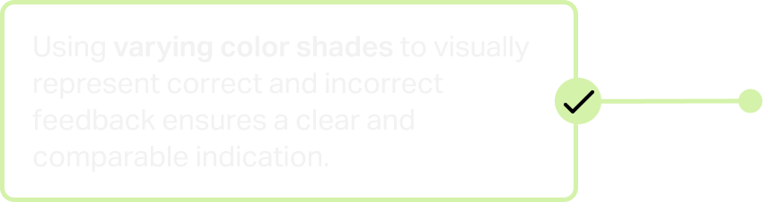
Provided thorough explanations in a cheerful tone.
Used distinct color shades to differentiate correct and incorrect responses.
Added viewing and posting comments on each question to foster community engagement.
Step 2. Prompt feedback on multiple selection quiz
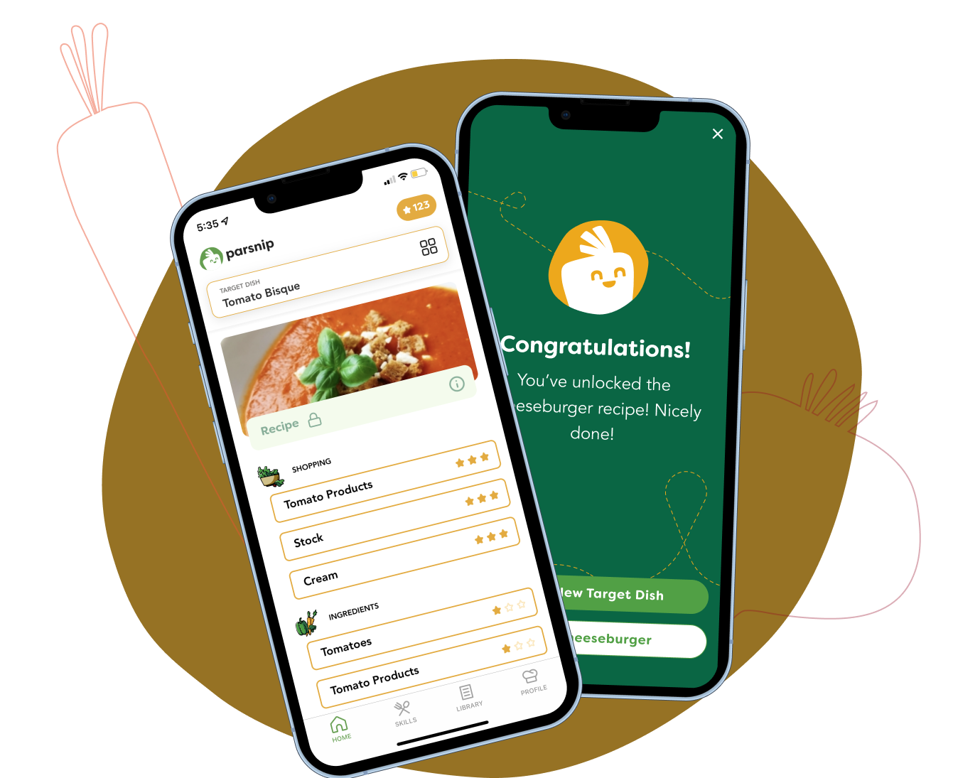
Step 3. Gamification and Incentivization

Gray cross-out to indicate incorrect answer choices, reducing user frustration and increasing the likelihood of selecting the correct answer on the second attempt, enhancing the learning experience.


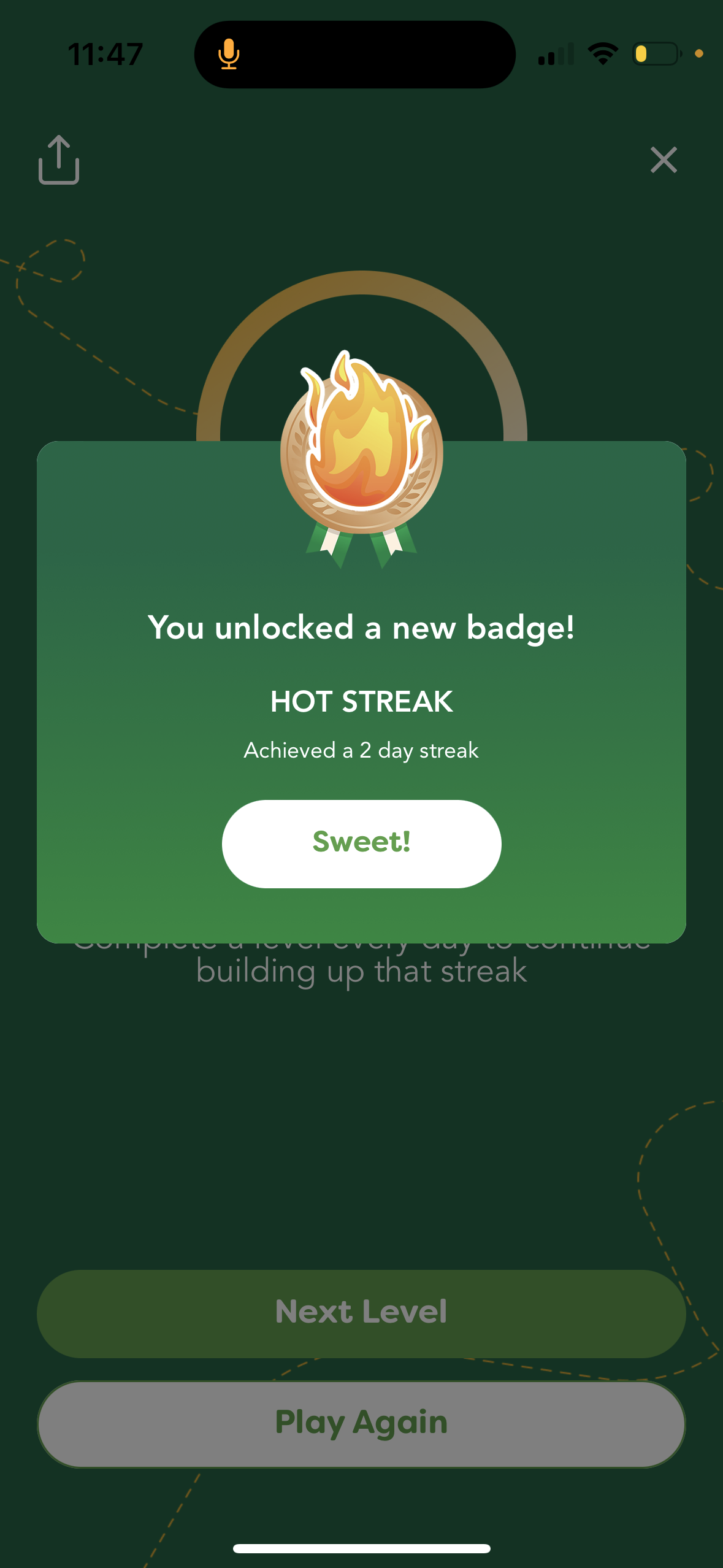
Proposed and implemented a gamification system, streaks and badges to encourage daily learning and foster a sense of accomplishment.
Persona stats on the profile page to motivate user engagement.

The new design solved the problem of user frustration during quizzing and learning, shortening the time to complete a level. Triggering users’ interests and improving their confidence in forming a learning habit.

Final Design - Clickable Prototype


“This new quiz interaction flow is much better than before, grey-cross out narrowed down to the correct answer for me, I learned new knowledge after playing a level.”
“I love the design of the streak. I’d wish to invite my friends in and to look at their scores and streaks!”

Re-validate with Users
📈
📲
How does the revamped app go?
Metrics and user feedback are here to tell.


🎲
💬


“You've improved it a lot already! I first tried it a while ago, found it confusing as you stated, and put it aside. I only recently picked it back up again as something enjoyable to do on my phone and not "doom scroll". This time it seemed a lot more intuitive, and I didn't even realize it was different, so I think that's a win for y'all!.”
A dad who has two 6 years old children - User from Hacker News
“The idea of a skill-tree for cooking sounds amazing. Just installed the app, the tutorial was super intuitive and easy to go through. Did the first lesson of Spaghetti aglio e olio.I would LOVE if this product existed and definitely pay for it, because I know cooking more could save me $400/month.”
A new grad who just move out of city - from Discord and Slack Community
Grow the audience, grow with our product
“What has stuck to me the most is all these little bits of knowledge, tips and tricks that I have been wondering my entire adulthood life about and never knew how to do. Seriously one of the more entertaining apps I’ve used in years, and I’m now more naturally drawn to cooking. ”
A young professional who lives by her own - User from App Store
“Well, not to brag, but this is exactly how Julia Child did "the way to cook". First few episodes were all fundamentals like how to dice, chop and julienne vegetables, how to quarter a chicken, your mother sauces, how to cook an egg, and so forth. I highly recommend it, and gamifying that system to me, would be awesome. Go Parsnip.”
A Cook Passionate - from Discord and Slack Community