Optimizing the Discovery Search Experience on the Pratt Institute Libraries Website
Case Study of a Usability Testing Project
UX Design Consultant
@ Center for Digital Experiences at Pratt Institute
Duration:
6 weeks (2021)
Team:
4 UX Consultants at Pratt Institute
My Roles:
Participant recruitment, running a screener survey
Usability testing tasks and interview question development
1 hour of moderated usability testing moderation with 4 participants
Rainbow sheet, quantitative and qualitative analysis on usability testing insights
Prototyping new design interface, and writing user testing report
Executive Summary
Through planning and conducting a moderated usability study on the new discovery interface of the Pratt Institute Libraries, our team identified 30+ opportunities in terms of usability and user experience. We then prototyped design solutions to solve the challenges and presented them to Pratt Institute Libraries Digital Team.
Make it easier for students to search in online library
Pratt Institute Libraries’ goal is to support the Institute’s academic programs by providing resources and services to students, faculty, and staff. The Libraries intend to upgrade their discovery interface, and want to assess whether the new interface is usable and helpful for students.
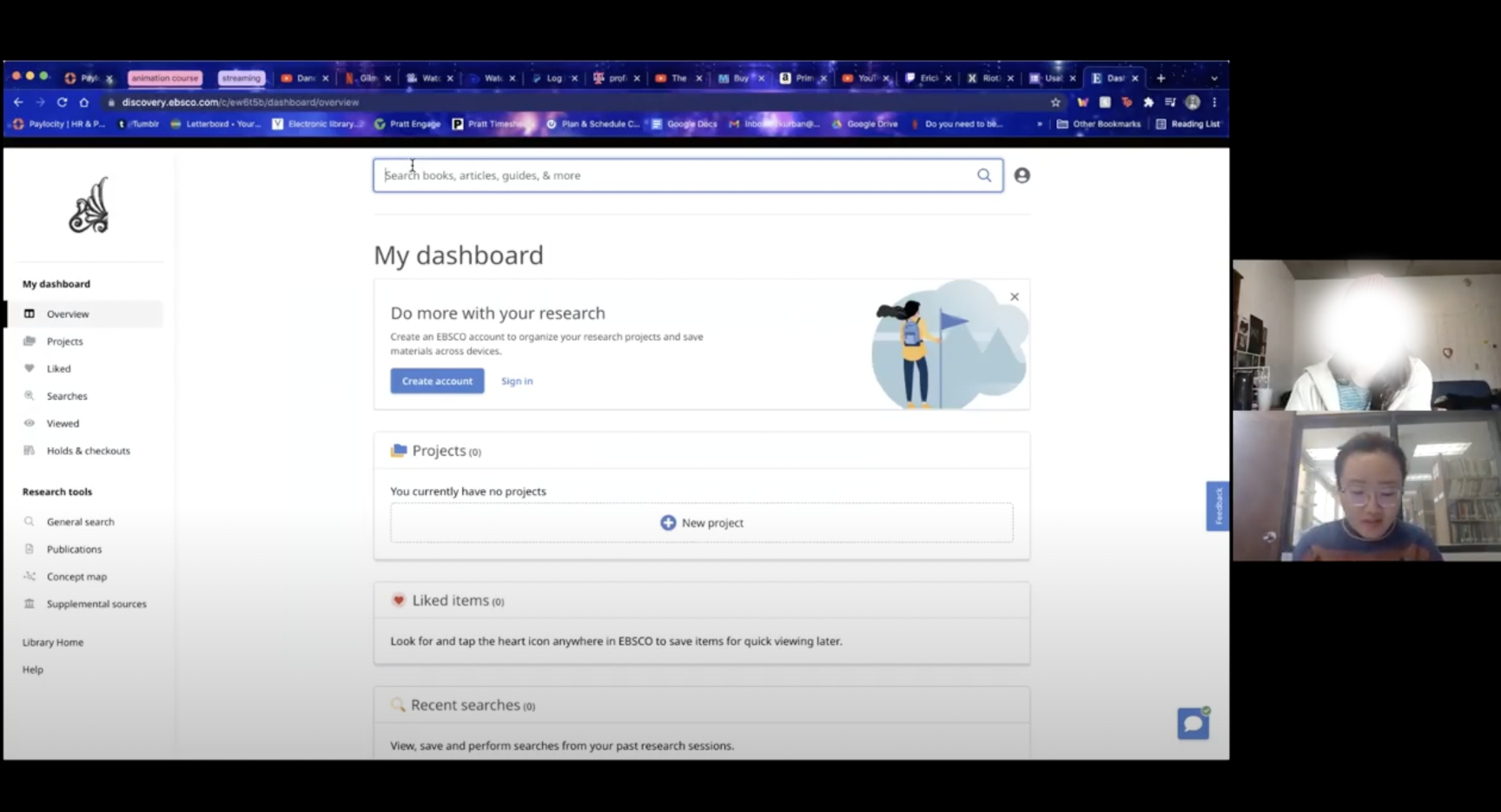
Current desktop EBSCO Discovery pages with Pratt Libraries →
Does the new interface provide a better search experience for students?
Our client wanted feedback on the usability of the new discovery interface, specifically for the ask-a-Librarian chat, keyword searches, filters, PDF readers, and icons from undergraduate students at Pratt Institute.
We conducted nine moderated remote usability tests to evaluate the usability of the new discovery interface and proposed design solutions to improve the search experience for undergraduate students.
To comprehensively uncover hidden usability issues and align with our client's objectives, I proposed to use the following research questions to guide our study:
-
Are students able to find and access what they are looking for?
-
What are students' impressions of the new search interface?
Creating a Research Roadmap
We planned out the entire study in 5 steps, with a research goal to uncover users’ interaction patterns and design seamless Discovery service experiences.


1.Recruitment & Test Planning
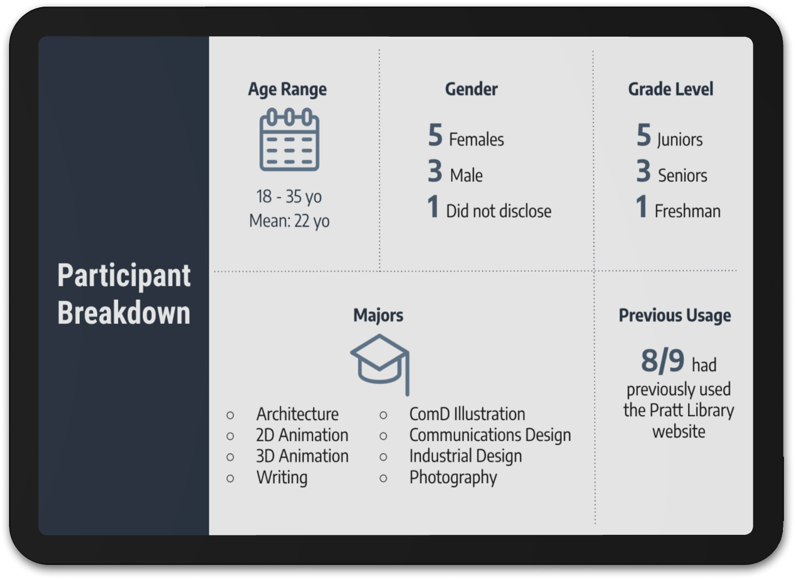
A screener was sent via email to students at Pratt Institute, we received 71 responses who are qualified for the study, finally 9 undergraduate students were invited to participate, and care was taken to invite students from a variety of grade levels and majors. Then, we organized UX Research Ops Team to facilitate the recruitment and participant management.
2.Remote Moderated Usability Testing with 9 Participants
Our tasks simulated a typical student’s journey through the new discovery interface. During 1-hour usability testing, we asked participants to complete tasks, observed the participants’ behaviors, and collected their data along 4 given tasks. While completing the tasks, participants openly shared their impressions of the experience, whether positive or negative. (Think Aloud)
Prior to starting our usability tests, four pilot tests were conducted to ensure that the tasks were easy to understand and not too difficult to complete.
-
1. What gender do you identify with?
2. Are you a part-time or full-time student?
3. How would you describe your comfort level when using library technologies? (1 = Very Comfortable, 5 = Not at all comfortable)
-
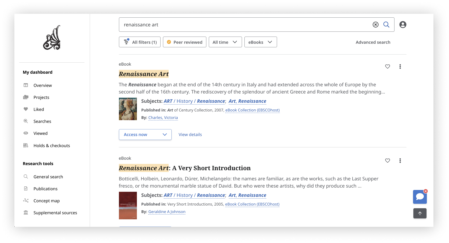
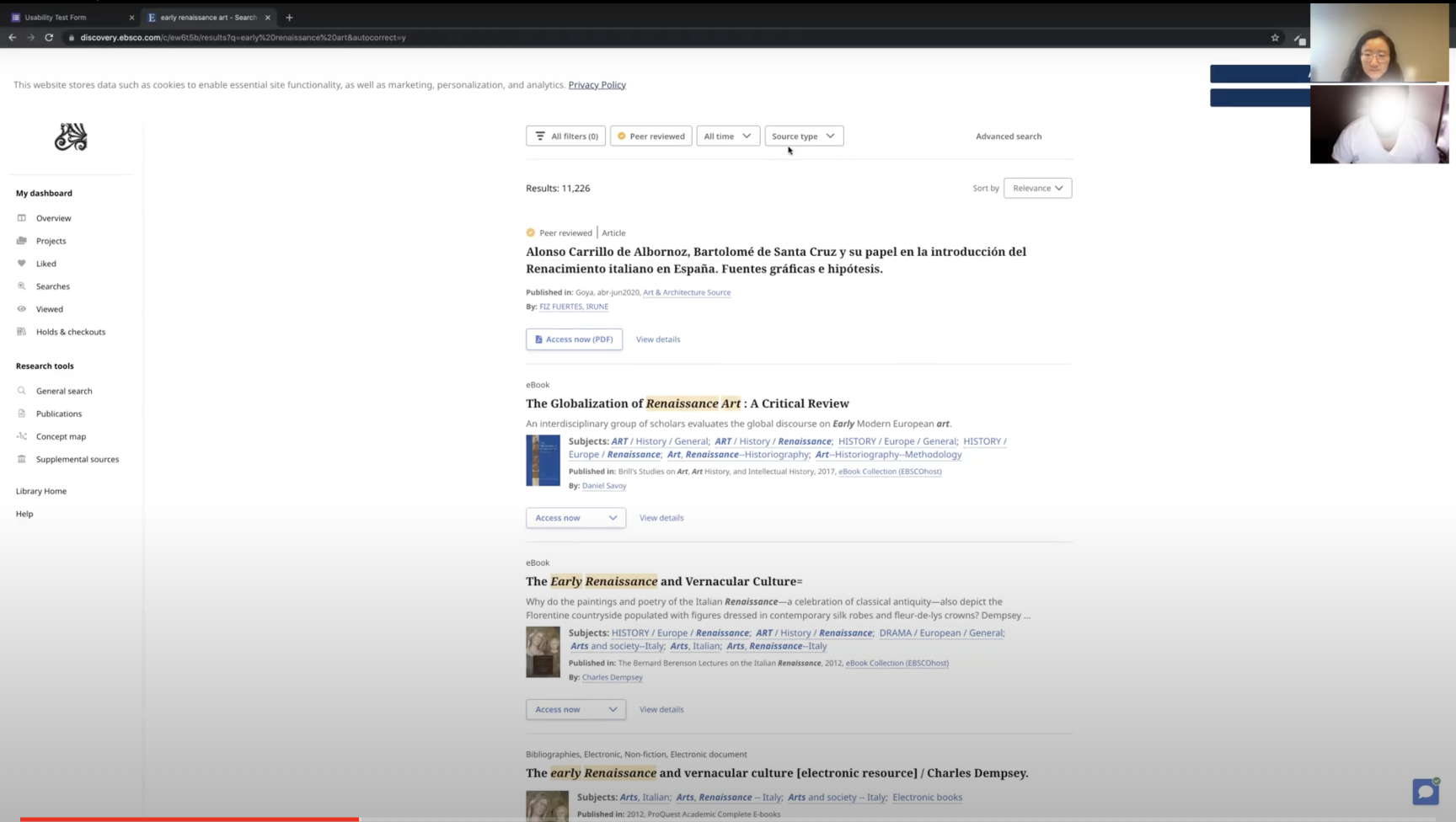
Scenario: You are writing a report on art styles during the Renaissance era. You are using the Pratt Libraries website to conduct your research.
Task 1: You are having trouble getting started with your research. Which tool would you use to connect with someone to find help?
Task 2: You remember your professor gave you some articles to read about art during the Renaissance period and you want to look up related books. Find a book that fits these criteria which you can read on your computer, and skim through the chapter titles of the book.
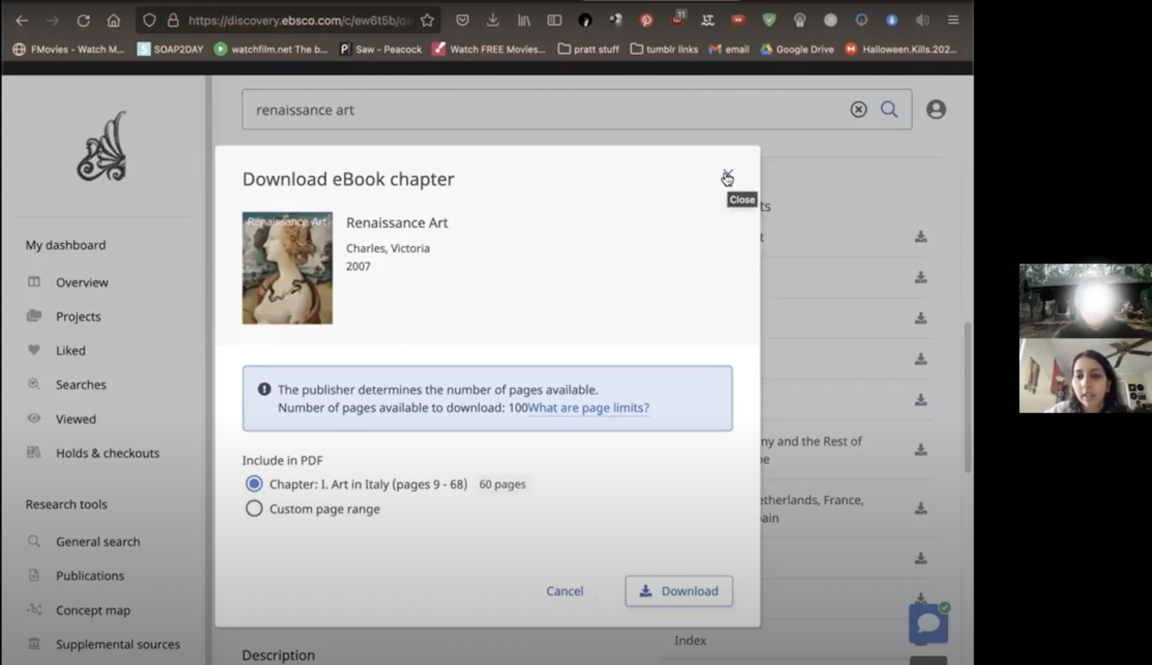
Task 3: You want to start reading on your subway commute. Save Chapter 1 on your computer.
Task 4: You want to include this book in your report as an APA reference. How would you find the information you need?
-
1. Please describe your overall experience with the website in three words.
2. What parts of the website did you like?
3. What parts of the website did you dislike?
4. How does this search tool compare to the current Pratt Library search tool?
-
*Each of the following statements was rated on a scale of 1 - 5 with 1 = Strongly agree and 5 = Strongly disagree
1. I think that I would like to use this system frequently.
2. I found the system unnecessarily complex.
3. I thought the system was easy to use.
4. I think that I would need the support of a technical person to be able to use this system.
5. I found the various functions in this system were well integrated.
6. I thought there was too much inconsistency in this system.
7. I would imagine that most people would learn to use this system very quickly.
8. I found the system very cumbersome to use.
9. I felt very confident using the system.
10. I needed to learn a lot of things before I could get going with this system.
3. Data Analysis
Quantitative Analysis
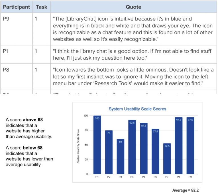
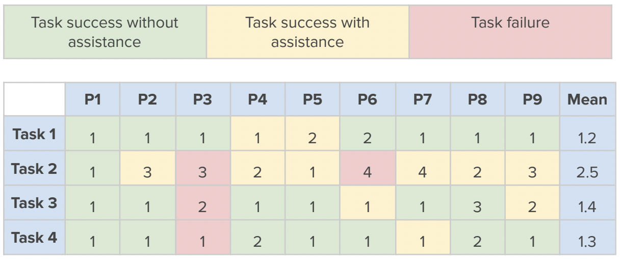
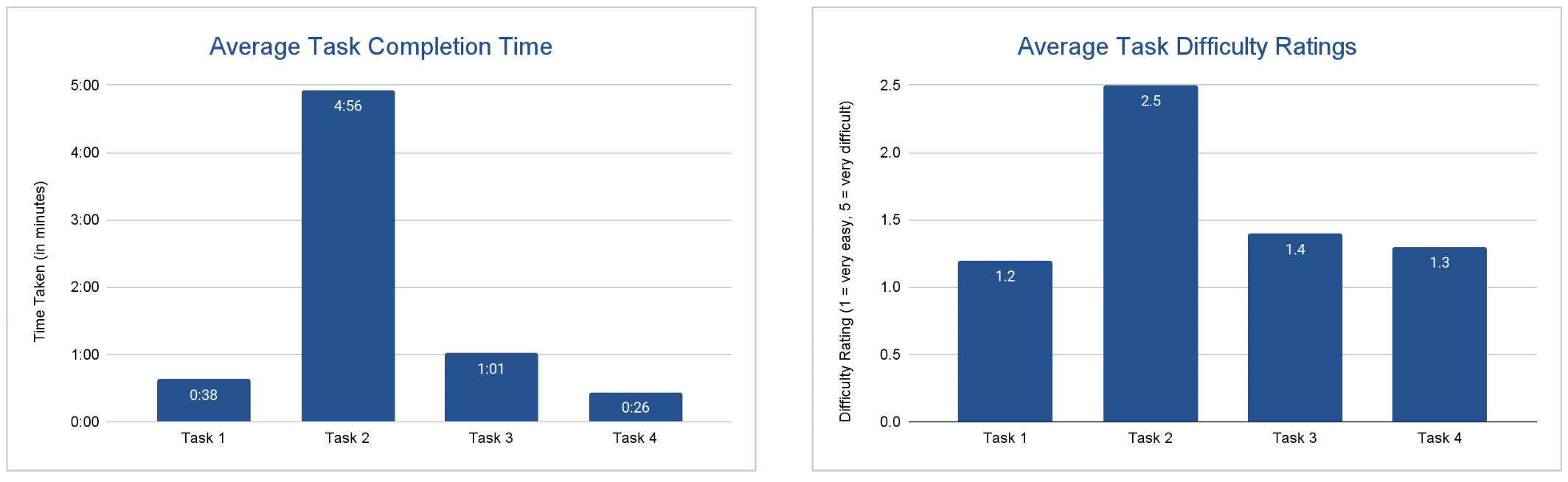
I proposed quantitative metrics, including Avg. Task Completion Time, Avg. Task Difficulty, Task Success and Failure, in conjunction with SUS score result.
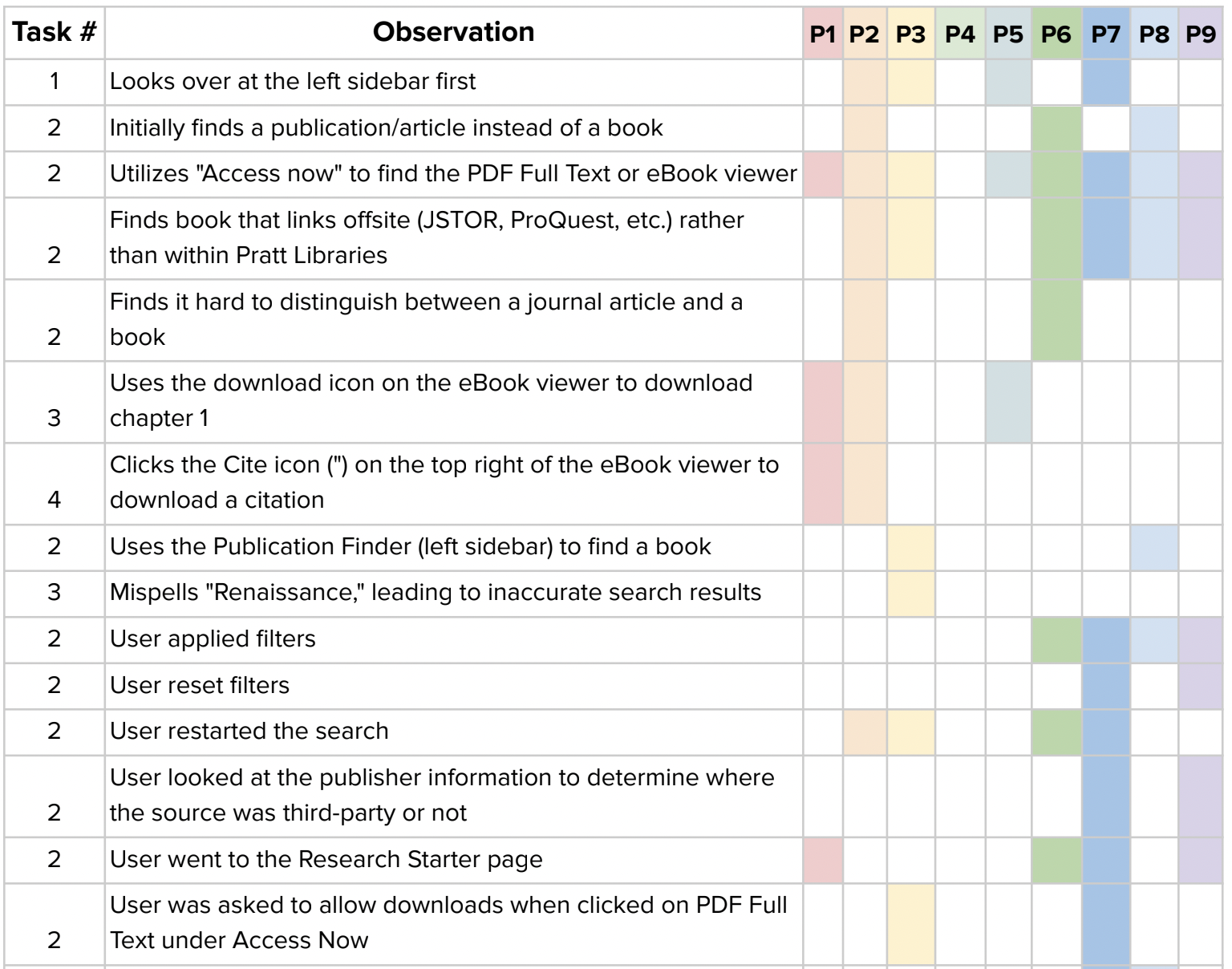
The rainbow sheet method was adopted by our team to synthesize observation data. 30 issues in 3 categories—Search, Filter, and Content—were prioritized by seen across four or more participants.
Qualitative Analysis

Overall, participants liked the updated version of the Discovery interface. Most participants believed that this new interface was an improvement compared to the existing platform.
The analysis from the Rainbow Sheets, along with metrics on average task difficulty and completion time, suggest that further improvements are needed to enhance its usability.
89%
of participants needed assistance to complete the second task
82.2
was the average System Usability Scale(SUS) score, indicating a higher-than-average level of usability
66%
of participants had trouble accessing the new interface's PDF Reader
“Easy”
was the most common word participants used to describe their search experience
Data Analysis
Findings & Design Solutions
Based on 5 major usability issues identified, we prototyped design solutions, using The Met’s existing style guide and design system components when possible.
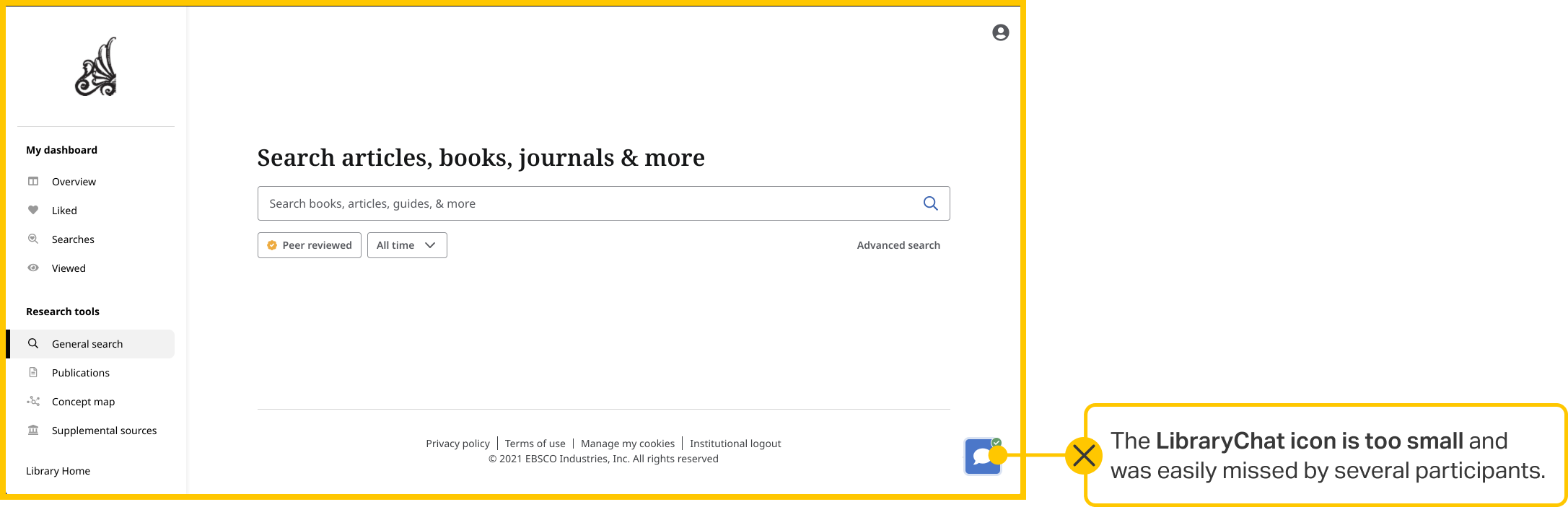
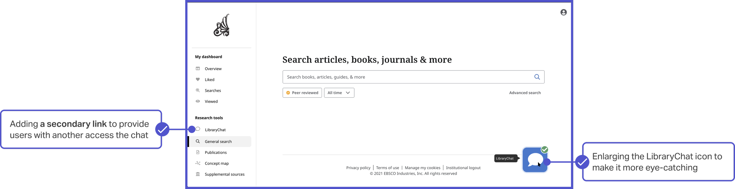
#1. Make the primary CTA stand out
The Library Chat button in the bottom right corner is too small and some participants missed the icon entirely. In addition, 4 participants initially attempted to locate this tool on the left sidebar.
Increasing the size of the Library Chat icon and adding a secondary link to it in the left sidebar would make the tool easily discoverable, allowing it to better assist students during their research.
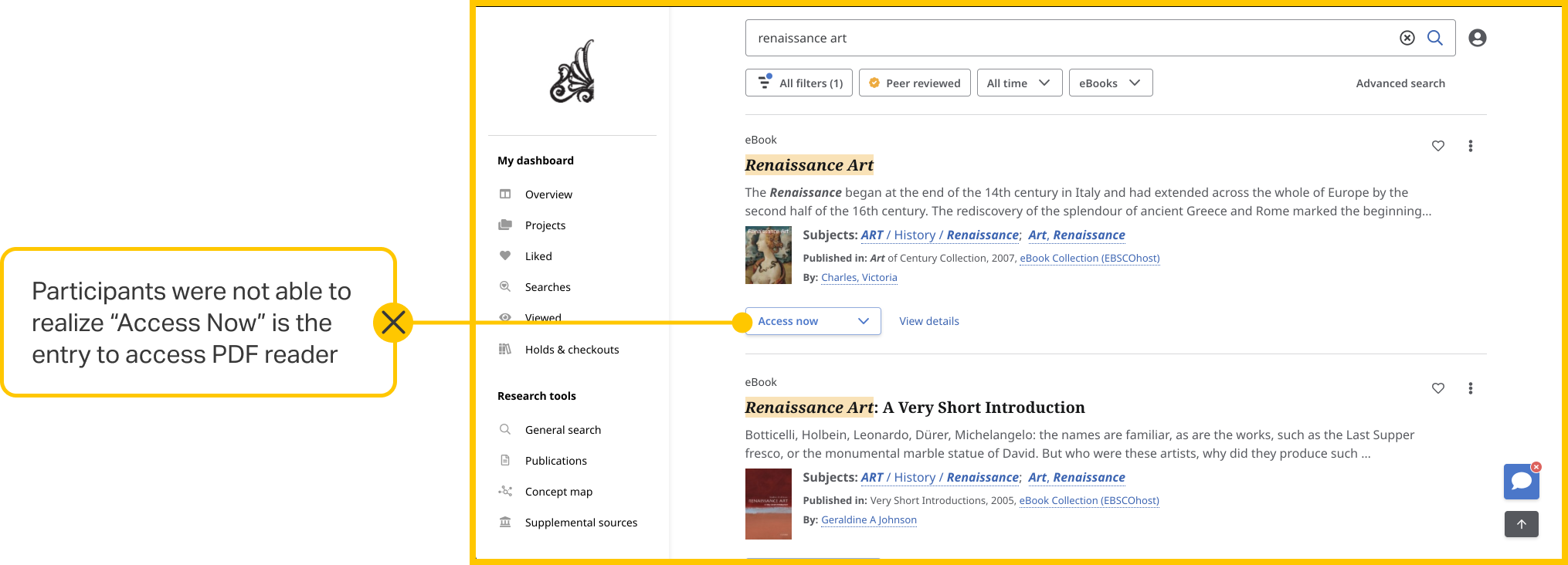
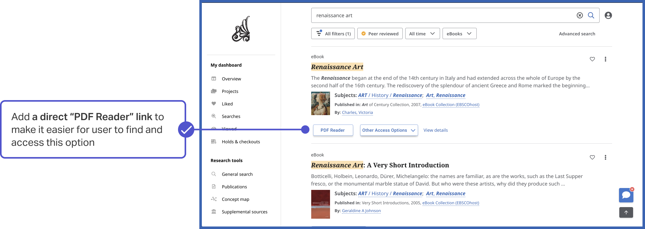
#2. Designing easy-access reader
Participants were unsure what the "Access now" submenu in each source card was for, and had difficulties accessing the PDF Reader within that submenu.
Adding a separate PDF Reader button on the source card and source details page would simplify the process and allow students to quickly navigate to the PDF Reader.
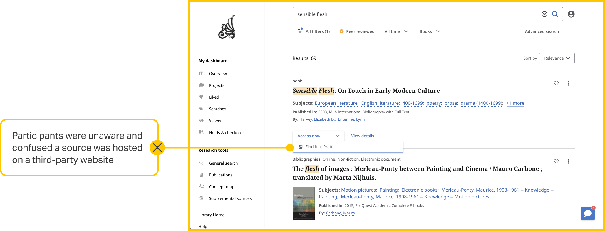
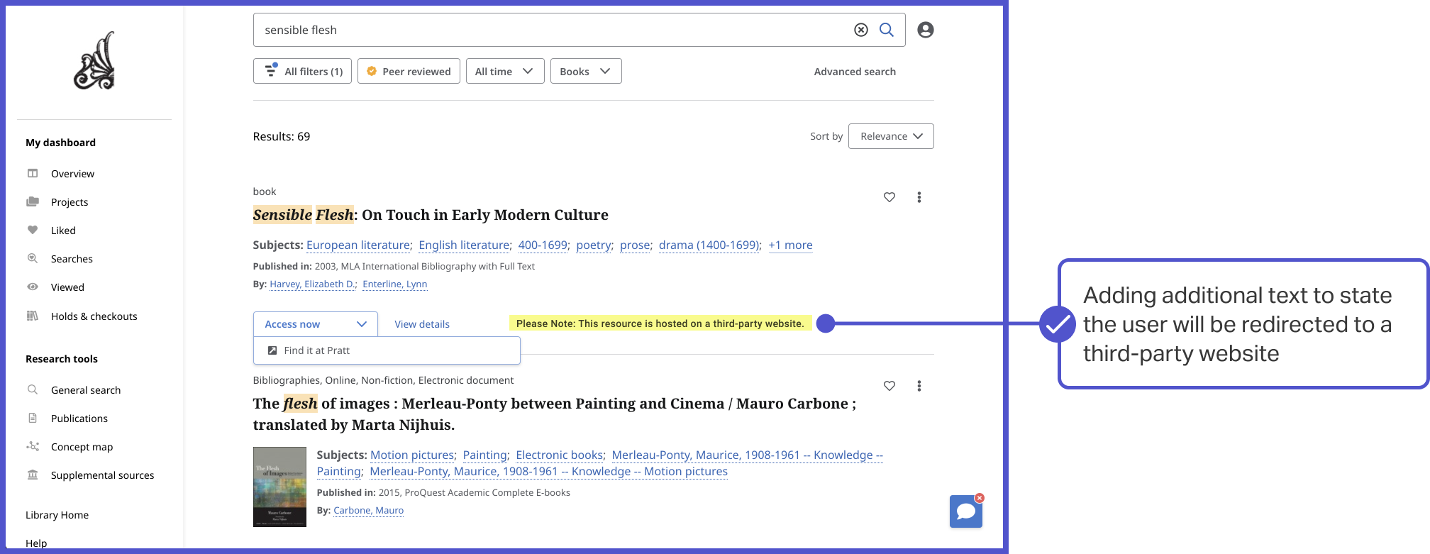
#3. Enhancing the Accuracy of Access Information
Users can only access materials from Pratt's internal collection through the PDF Reader. However, many participants found it difficult to identify which materials belonged to Pratt's own collection, often mistakenly navigating to external sources.
Adding some distinguishing text on each source card that provides information about whether a source is hosted internally or externally would make this clearer to students and streamline their research process.
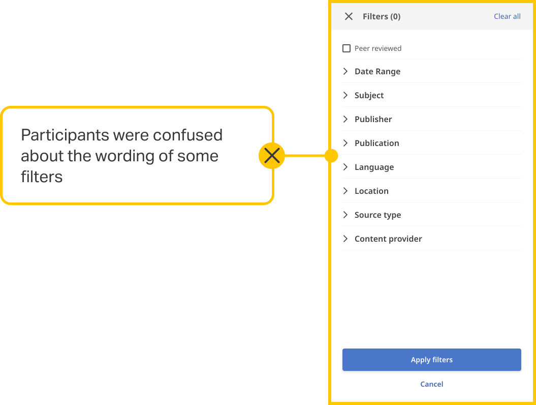
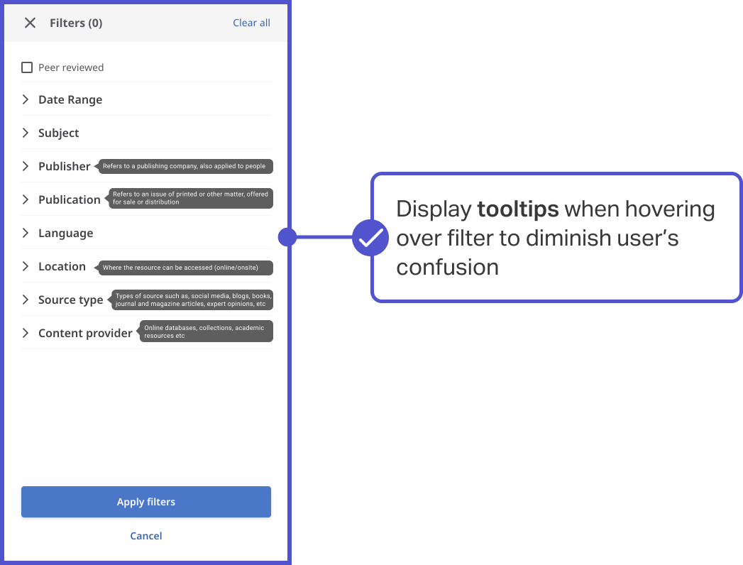
#4. Redesigning the filter tooltips for better understandability
Almost half of the participants applied filters when conducting searches, and participants had mixed feelings toward the filters. Participants were confused by the wording of some categories such as "Publisher” and “Publication".
Displaying tooltips when hovering over a filter category would be very helpful to help students understand what each filter does, thus eliminating ambiguity during the research process.

Takeaways
I enjoyed seeing how students compared their experience with the new interface to the previous one, which gave me more proof of the impact and the effect brought by the new design.
Quantitative data serves as a compass, providing a broad overview of the existing challenges and issues. However, to truly understand and empathize with users' pain points, a deeper dive into qualitative data and analysis is essential.
Outcome
Our client, Nick Dease - Product Manager and Digital Learning Librarian at The Pratt Institute Libraries. He was very pleased with our work and acknowledged the significance of our proposed design solutions, particularly Recommendations 2 and 4, which were great suggestions to consider adding to the discovery interface, which Pratt Institute Libraries is looking to implement in the summer of 2022.