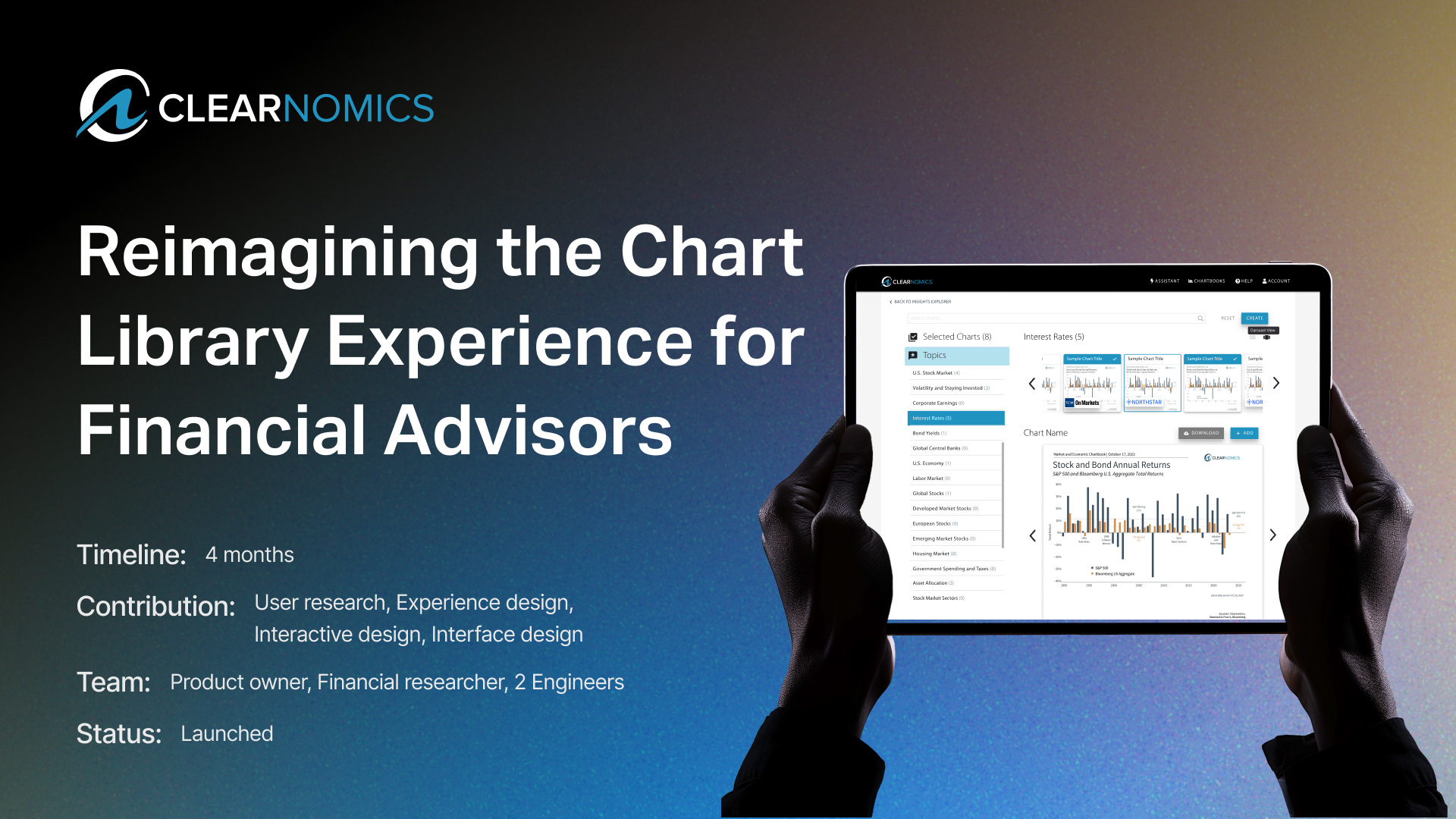
Reimagining the Chart Library Experience for Financial Advisors
Designing clarity that doubled adoption and cut time-to-value.
Impact chips:
5 → 1-2 steps • 2x usage in first release window • Satisfaction • Foundation for recommendations + auto-tagging
Timeline:
12 weeks (end-to-end from research to launch)
Responsbility Scope:
Strategy • UX Architecture • UI Design • Testing • Delivery
Role:
Lead Product & UX Designer

Scope of the Project
Core problem:
The Chart Library (CL) was under-discovered and hard to evaluate, optimizing for power users while leaving new advisors behind—slowing time-to-insight and weakening client conversations.
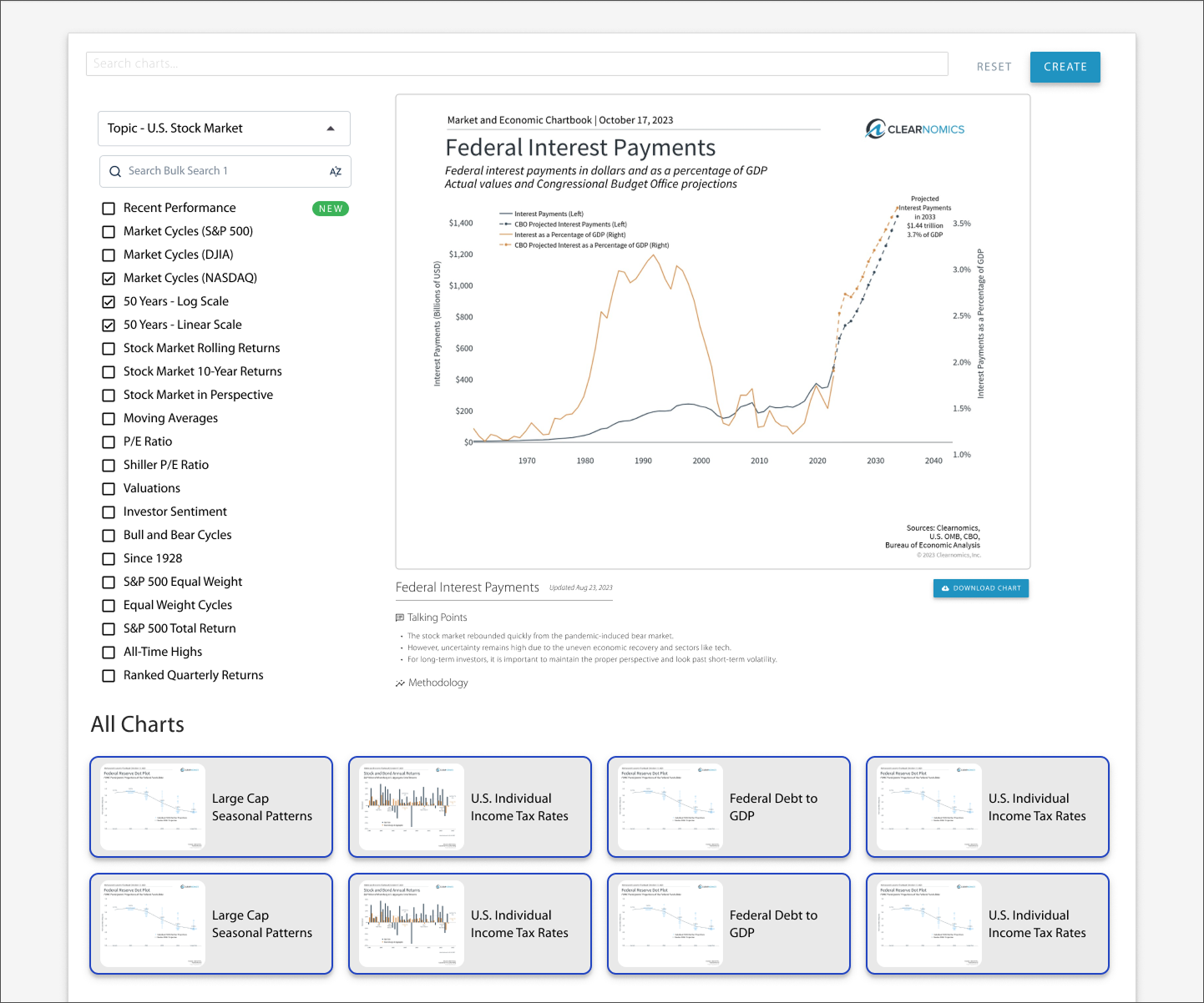
I reframed the CL from a buried asset into a guided insights hub. By moving the primary touchpoint to the homepage, introducing topic-first navigation, live previews, persistent filters, and a Create modal (articles, chartbooks, videos), the experience now leads advisors from explore → select → assemble with far less friction—supporting both new and experienced users.

📈 Impact
Strategic unlock: foundation for insight recommendations & auto-tagging
+ 20%

Improved financial advisor satisfaction by 20%
+ 25%

Increased deals by 25%, facilitated the partnership with TCW, a leading global asset management firm
+ 300%

Improved development speed by 300%

Design Evolution
⓵ Early Prototype
This is what the UI looked like when I first joined the early project.
⓵ Early Prototype
This is what the UI looked like when I first joined the early project.
Uncovering the Core Problem
Why is something so powerful so invisible?
Financial advisors operate in volatile markets where every second counts. They need to interpret data quickly and present it confidently to clients.
Yet the existing Chart Library demanded 4–5 clicks to reach, offered tiny previews, and lacked a clear discovery path.
The real issue wasn’t simply visibility. The system’s structure didn’t align with how advisors think — how they browse, evaluate, and transform data into stories.
I approached it as a systems-level challenge: one of visibility, relevance, and trust.
What our user said
I led interviews with six advisors (new and experienced), mapping their workflows and mental models.
What we learned:
1️⃣ Advisors valued charts less for raw data and more for creating videos, slides, etc;
2️⃣ New advisors were often lost, yet the system was designed almost for veterans.
3️⃣ The library felt like a dead end, the browsing experience is friction-heavy.
I approached it as a systems-level challenge: one of visibility, relevance, and trust.

Workshops and journey mapping confirmed this.
😩 Poor hierarchy, high cognitive load, and “dead-end” interactions that eroded confidence.
⛳️ It became clear now, we didn’t just need a cleaner interface, we needed an experience that guided exploration and inspired creation.


At this stage, the team leaned toward surface fixes.
But I pushed us to reframe: not ‘make the library easier,’ but:
How might we make chart exploration feel fast, intuitive, and accurate for insight creation?

Perspective Shift
We defined two personas:
Exploratory (new) – needs orientation, categories, and visual cues.
Purposeful (experienced) – needs precision, speed, and control.
Our bottom-up flow (starting from browsing and selection) served only experts.
Flip the model: a top-down, topic-first entry that invites exploration from the first click.
Flipped the model: Bottom-up flow to Top-down flow


Competitor Research — Setting UX Benchmarking
Facing scale and speed constraints, I benchmarked systems like Google Drive, Spotify, YCharts, and Morningstar to answer:
🤔 How do they balance discovery with execution for different user intents?
🤔 How do they handle scale, search, and preview at speed?
The answer was Consistency:
1️⃣ Topic-/collection-first entry lowers cognitive load
2️⃣ Multi-select filters + persistent states reduce rework
3️⃣ Live visual previews remove guesswork
4️⃣ Consistent labels/actions build trust
And these become our design guidelines -
The best tools feel fast because they remove decision friction.

Design Exploration - Step 1
Following our guidelines, we explored 7 directions, mixing placement of filters, grid/list/carousel, persistent preview, selected set, talking points.
What we learned:
👉 Dense grids: efficient for experts, overwhelming for new users
👉 Preview-first: good evaluation, buried navigation
👉 Multi-panel: balanced but high cognitive load
👉 Topic-first: reduced friction for new users, preserved expert speed → kept

From there, we boiled down to three directions:
V1: A light-touch refresh—quick wins but shallow impact.
V2: A redesigned interface with live previews—better usability, but confusing for new users.
V3: A fully reimagined system—resonated strongly, but required careful scoping.
Version 1 - A Simple Move
A light-touch refresh—quick wins but shallow impact.

Version 2 - Live Previews
A redesigned interface with live previews —better usability, but harder onboarding and confusing for new users.
Version 3 - Fully Reimagined
A fully reimagined system—resonated strongly, but required careful scoping for delivery.

Step 2 - Early Sketches
Finding the touch point for the Chart Library turned out to be as much an organizational challenge as a design one - to maximize adoption and time-to-value.
Landing a path that balanced user behavior, org constraints, and future integration.
I proposed and validated three directions:
1️⃣ A standalone tab for clarity and separation
2️⃣ Embedding it directly on the homepage (ultimately chosen)
3️⃣ Merged with “My Insights” for long-term consolidation

Merge Step 1 & Step 2, we
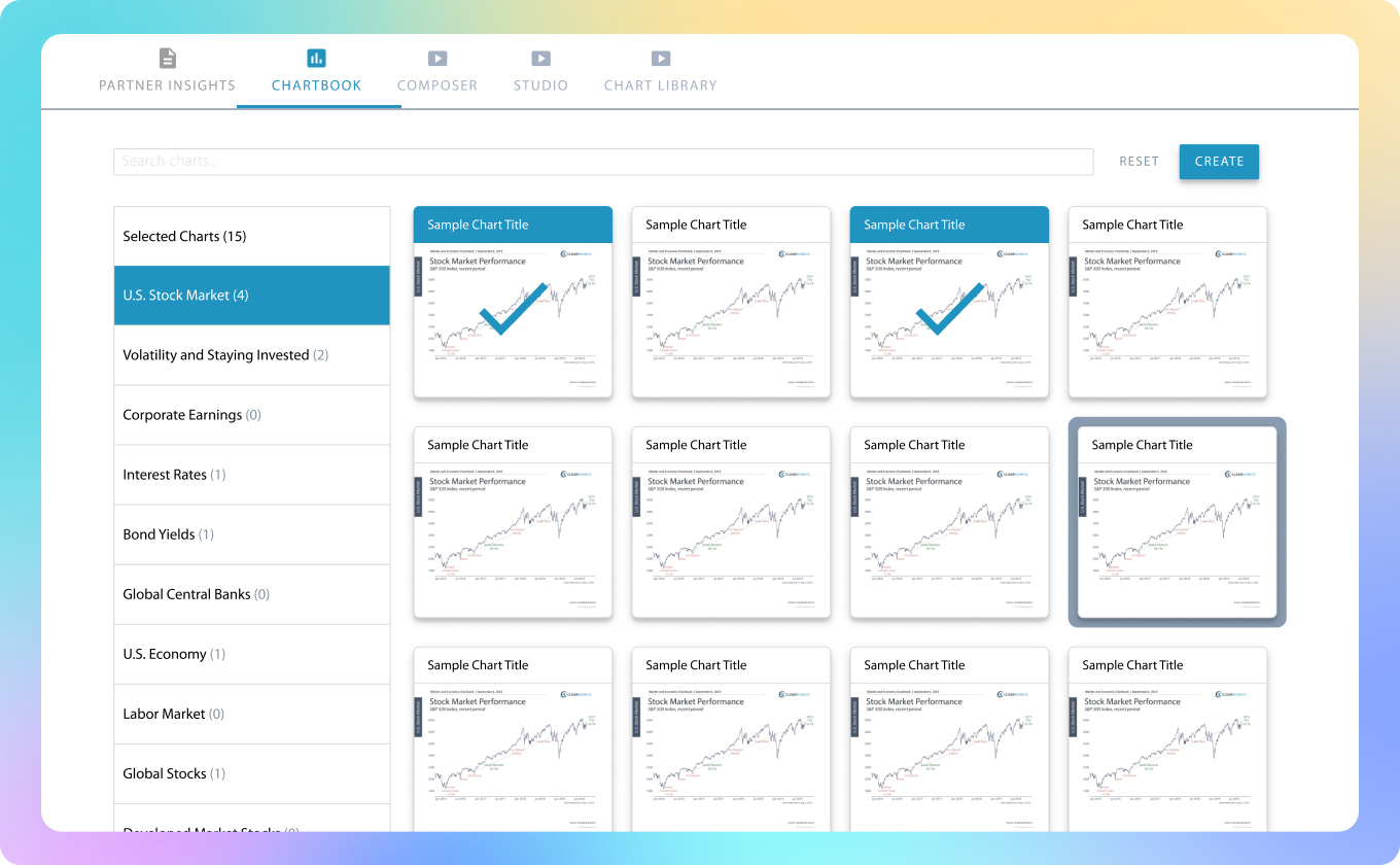
Solution - 2 Panels with Preview
Decision Matricx (What I Optimized For)
Homepage placement proved a strategic win:
it boosted discoverability, aligned with advisor workflows, and set the stage for deeper integration.
I prioritized:
Adoption & time-to-first-value (primary)
Cognitive load for new users (topic-first entry)
Path to creation (charts → stories, not charts → dead end)
Feasibility & sequencing (ship now, scale later)

The Final Experience
Merge Step 1 & Step 2, we now have the complete flow:
👉 Homepage → Chart Library → Browse → Preview → Multi-Select → Create
Key Features
Topic-first navigation — intuitive entry for new users.
Visual filters + toggleable views — adaptable to workflow.
Carousel previews — fast scanning of multiple charts.
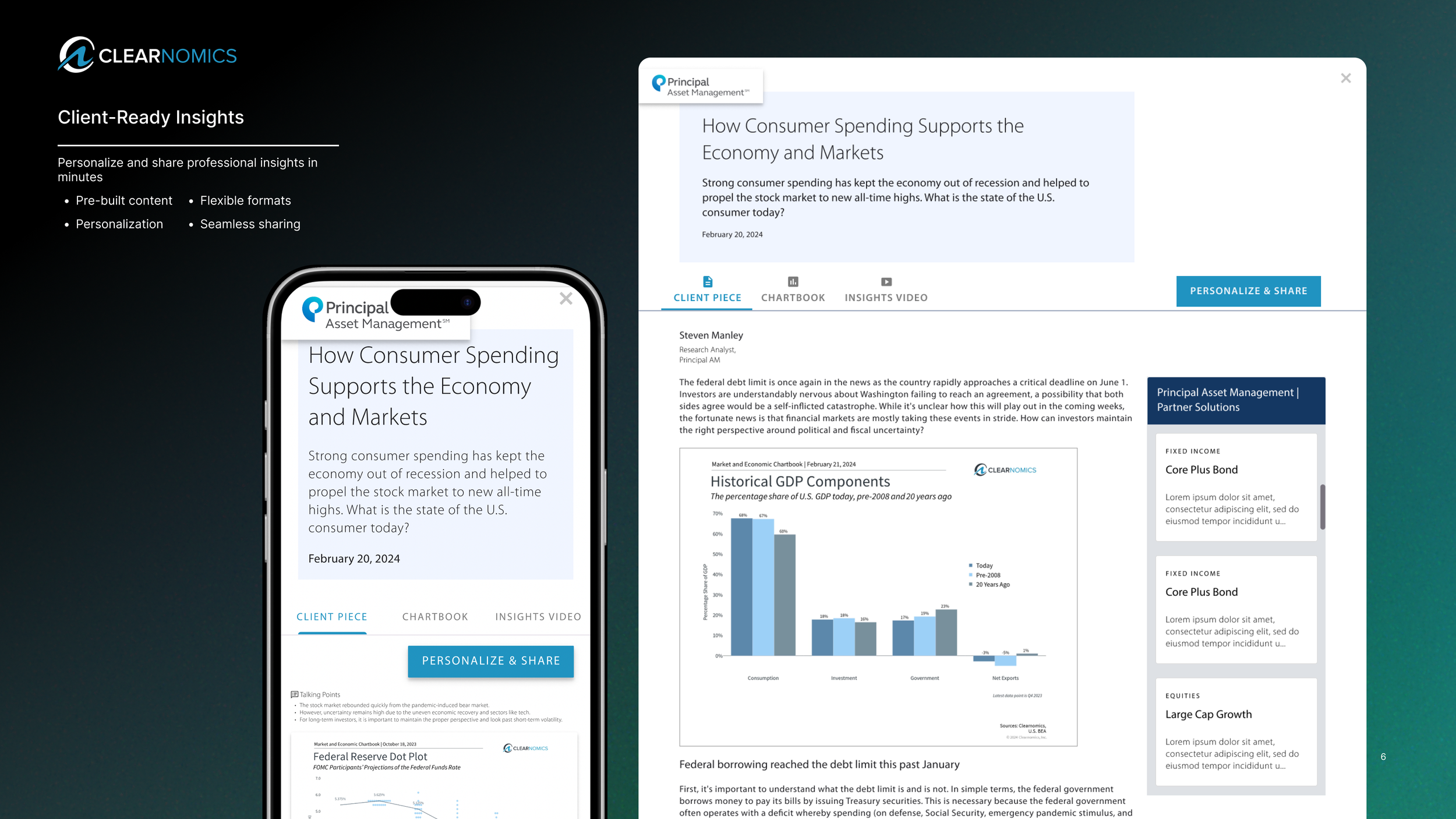
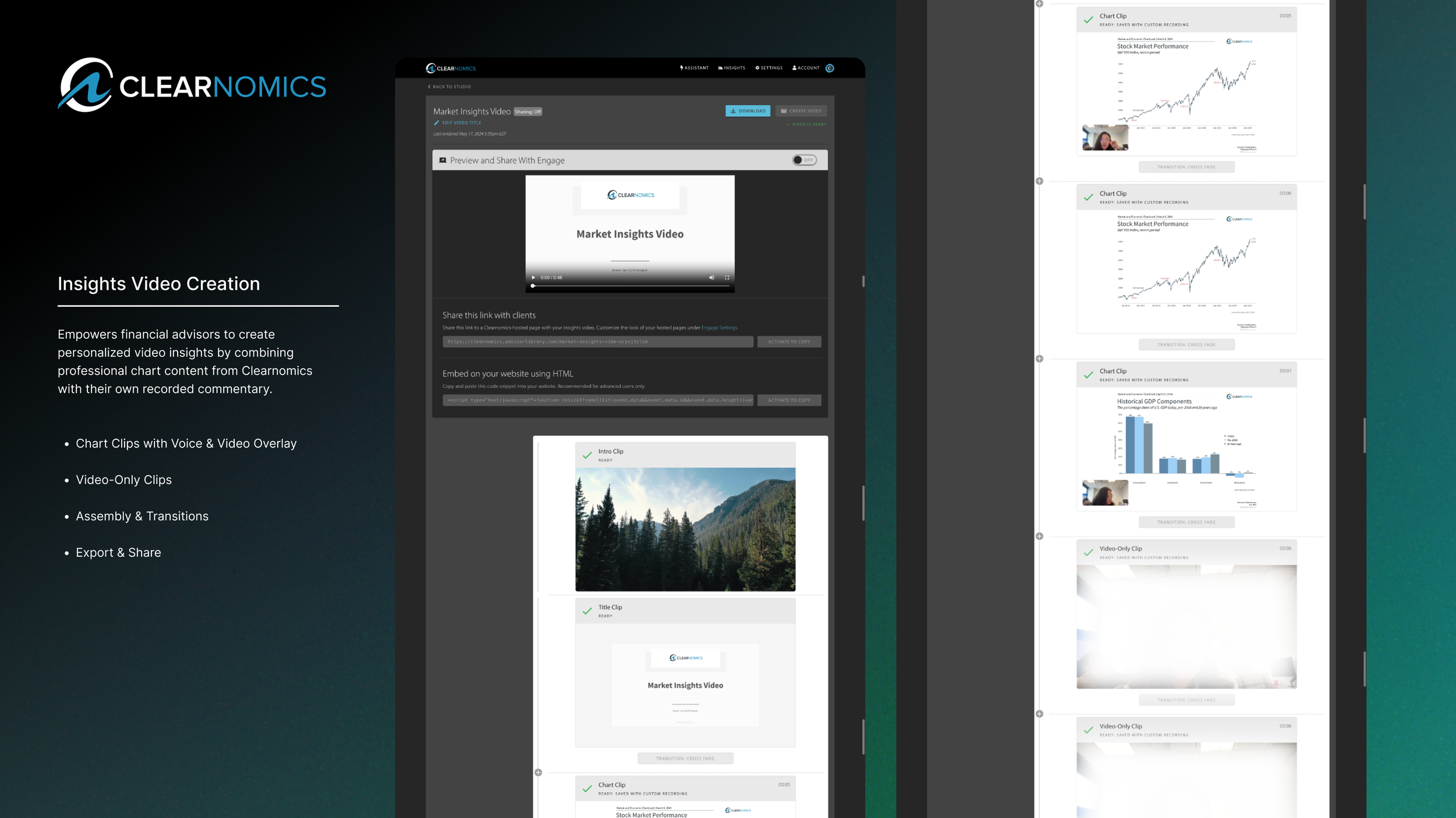
Creation modal — one-click generation of articles, chartbooks, or videos.
We intentionally avoided complexity creep, focusing on clarity, speed, and scalability.


Outcomes
⬇ Chart access steps: 5 → 1–2
⬆ Usage: 2× increase in first release window
⬆ User satisfaction: clearer navigation, faster workflows
📈 Strategic unlock: foundation for insight recommendations & auto-tagging
+ 20%
+ 300%
+ 25%

Reflection
This project taught me that:
Curiosity reveals deeper problems than certainty.
Transformation often comes from rethinking entry points, not adding features.
Designing for dual personas isn’t compromise — it’s orchestration.
More than a redesign, this was a strategic repositioning of how advisors engage with insights — proof that clarity builds trust at every level of product design.