

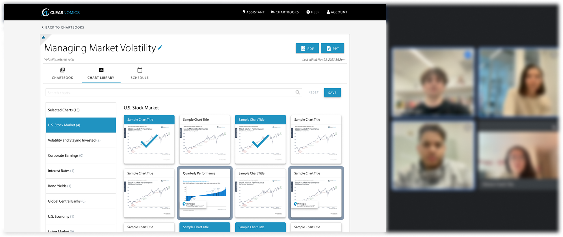
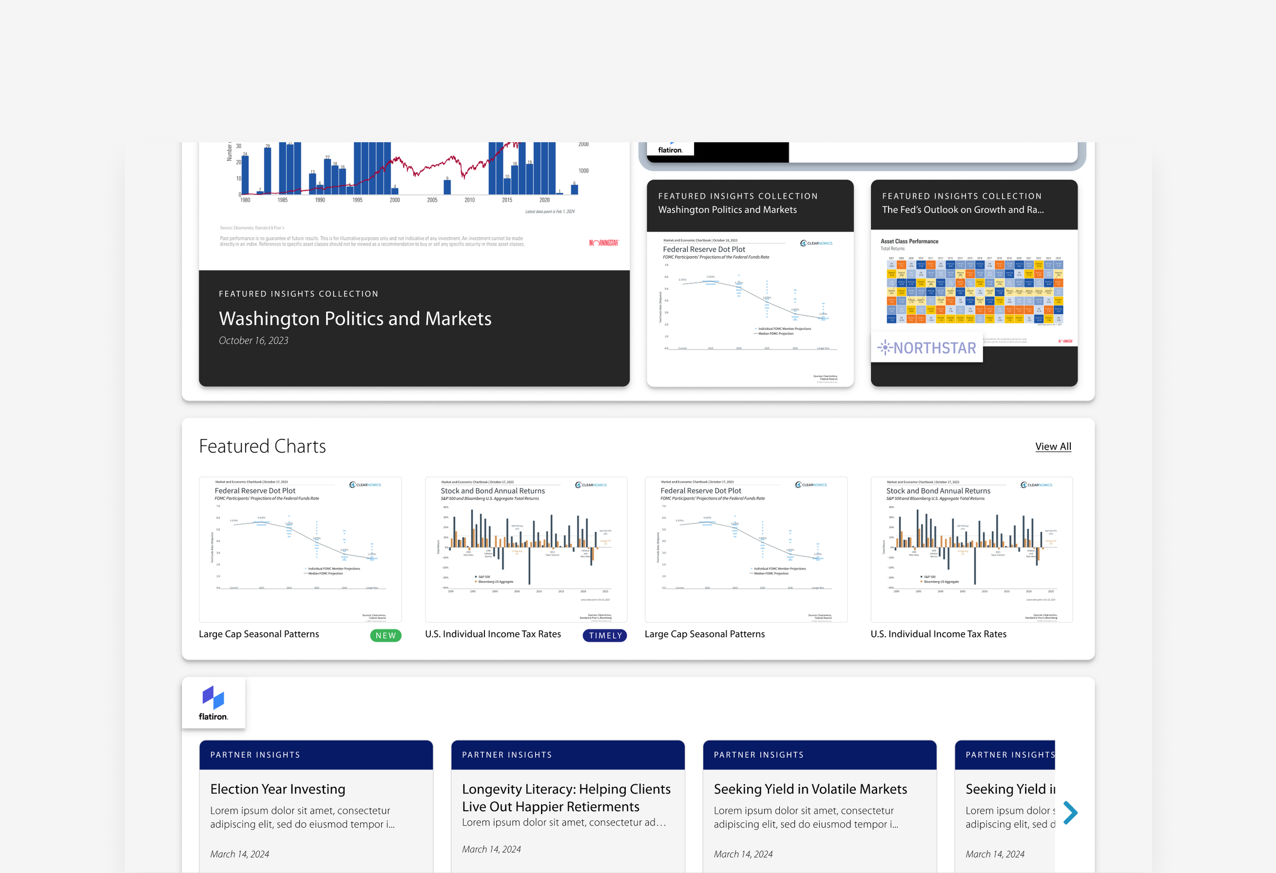
Chart Library, Clearnomics
ROLE:
Lead Product & UX Designer
RESPONSIBILITIES:
Product strategy and UX architecture
UI design, testing and delievery
TIMELINE:
12 weeks (2024)
TEAM:
Engineers, PM, Marketing, Financial researcher
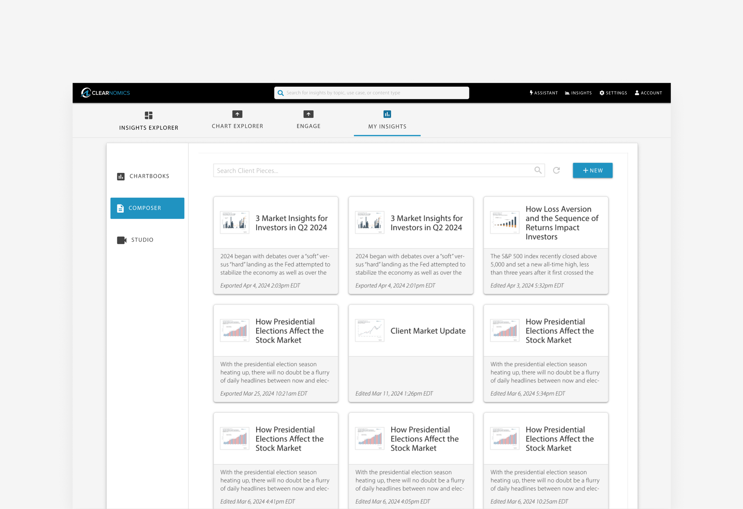
Clearnomics equips wealth advisors with clear, data-driven market and economic insights. Its easy-to-use dashboards, visuals, and commentary help advisors communicate complex trends simply.
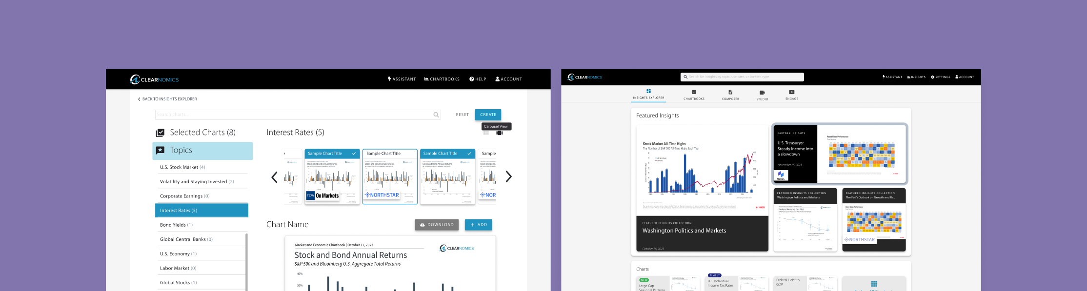
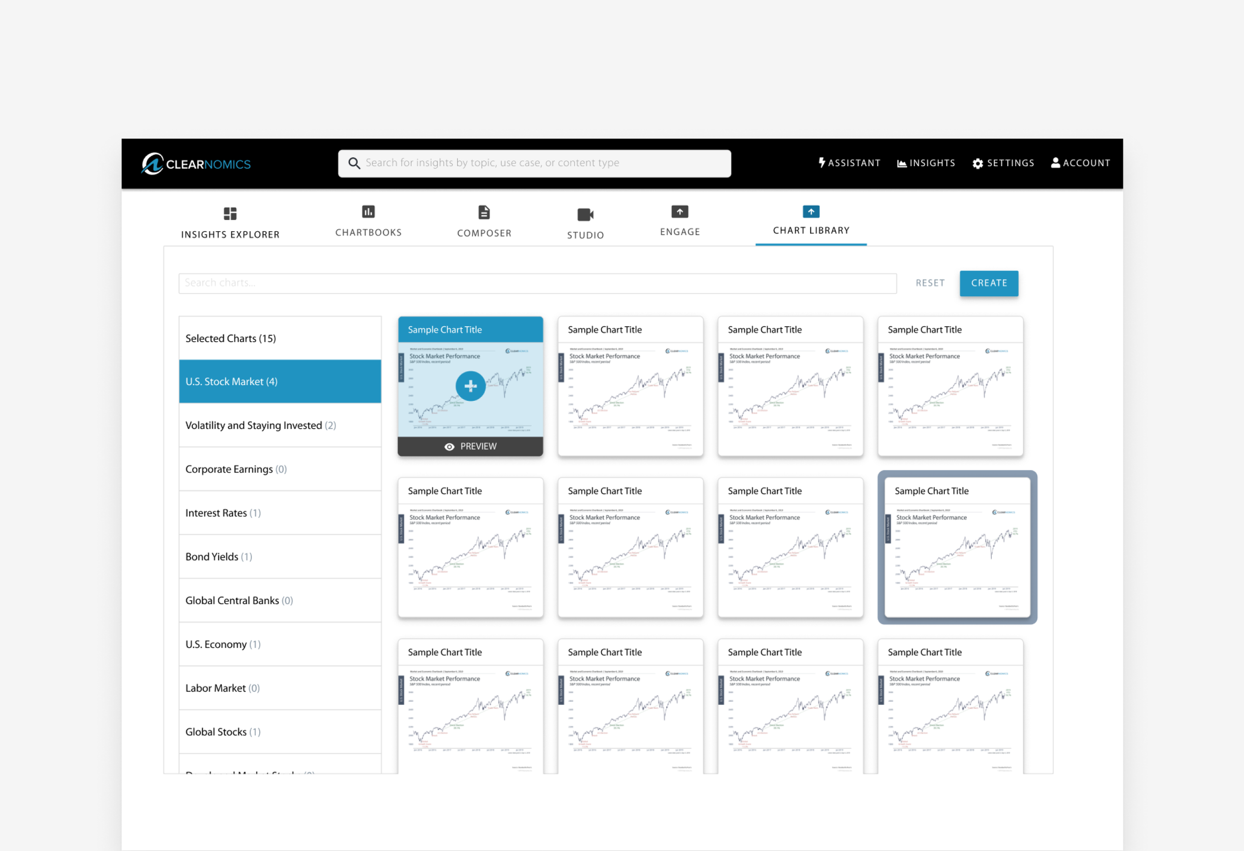
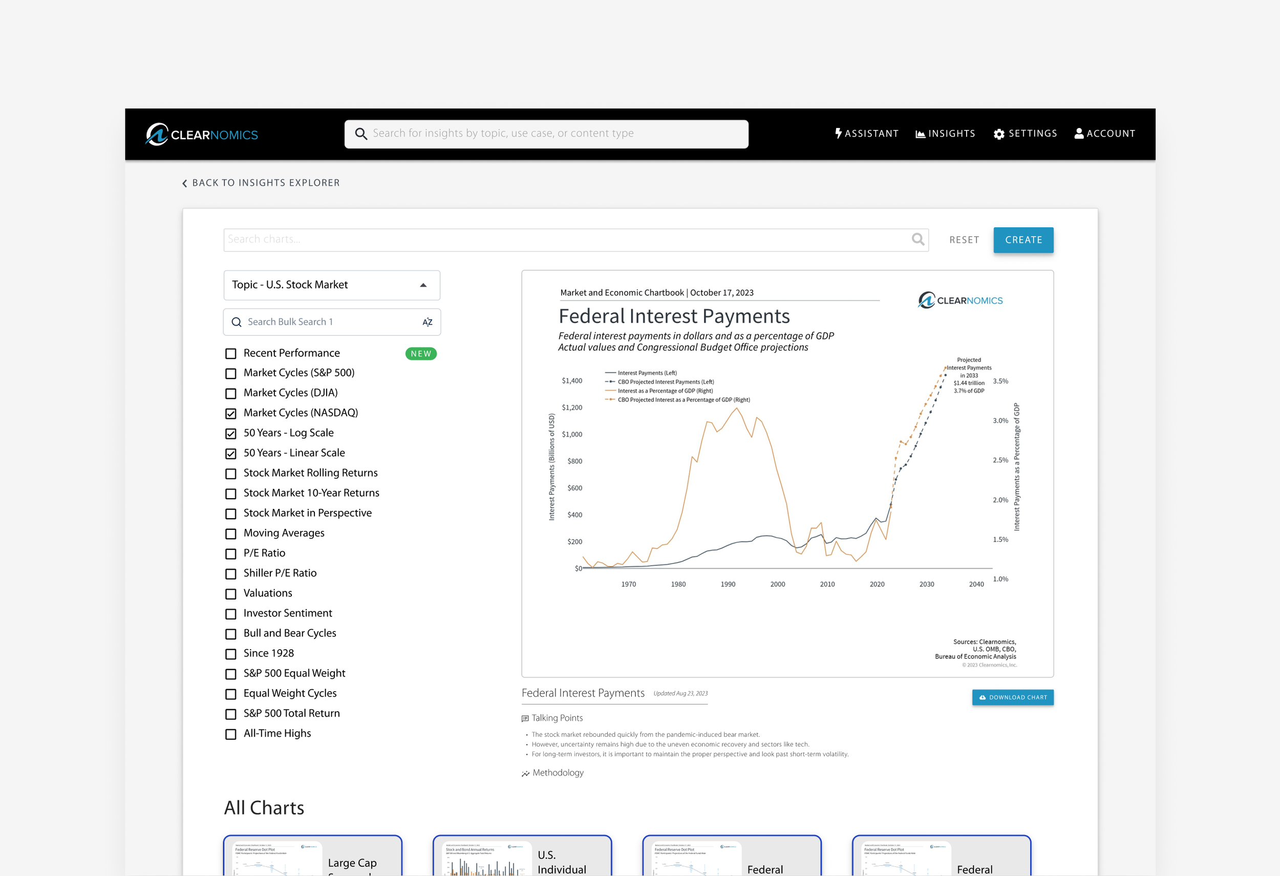
The Chart Library is Clearnomics’ unified data-visualization system, offering a consistent set of chart components, interaction patterns, and visual rules. Each chart surfaces Clearnomics’ proprietary market and economic insights directly within the visualization. Advisors can then select the specific charts most relevant, whether they’re focused on a single ETF or a broader investment strategy.
Problem Statement
The Chart Library (CL) was hard to find and even harder for new advisors to interpret, slowing time-to-insight and weakening client conversations
I reframed the CL from a buried tool into a guided insights hub. By bringing it to the homepage and adding topic-first navigation, live previews, persistent filters, and a simple “Create” flow, advisors can now move from explore → select → assemble with far less friction.
Solution Impact
I repositioned the Chart Library as a guided insights hub. By moving it to the homepage and adding clearer navigation, live previews, persistent filters, and a streamlined “Create” flow, advisors can now easily explore, choose, and assemble the charts most relevant to their clients.
Improved financial advisor satisfaction by 20%
Drove a 2x increase in Chart Library usage within the first release window
Increased deals by 25%, facilitated the partnership with TCW, a leading global asset management firm
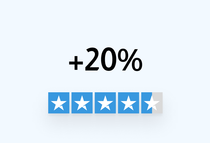
Improved financial advisor satisfaction by 20%
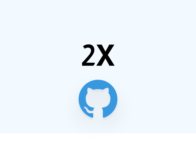
2X Chart Library adoption
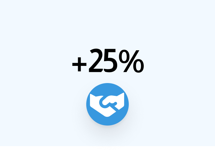
+25% deal growth via TCW partnership
Caption for the image, you can even add a link here to Figma or Miro if needed
Key Findings:
Charts were valued less as raw data and more as ingredients for videos, slides, and client stories.
New advisors felt lost, while the system was unintentionally optimized for experts.
The library felt like a dead end, high friction, low guidance, weak browsing tools.
Poor hierarchy created cognitive overload
Tiny previews made evaluation guesswork
Dead-end interactions eroded confidence
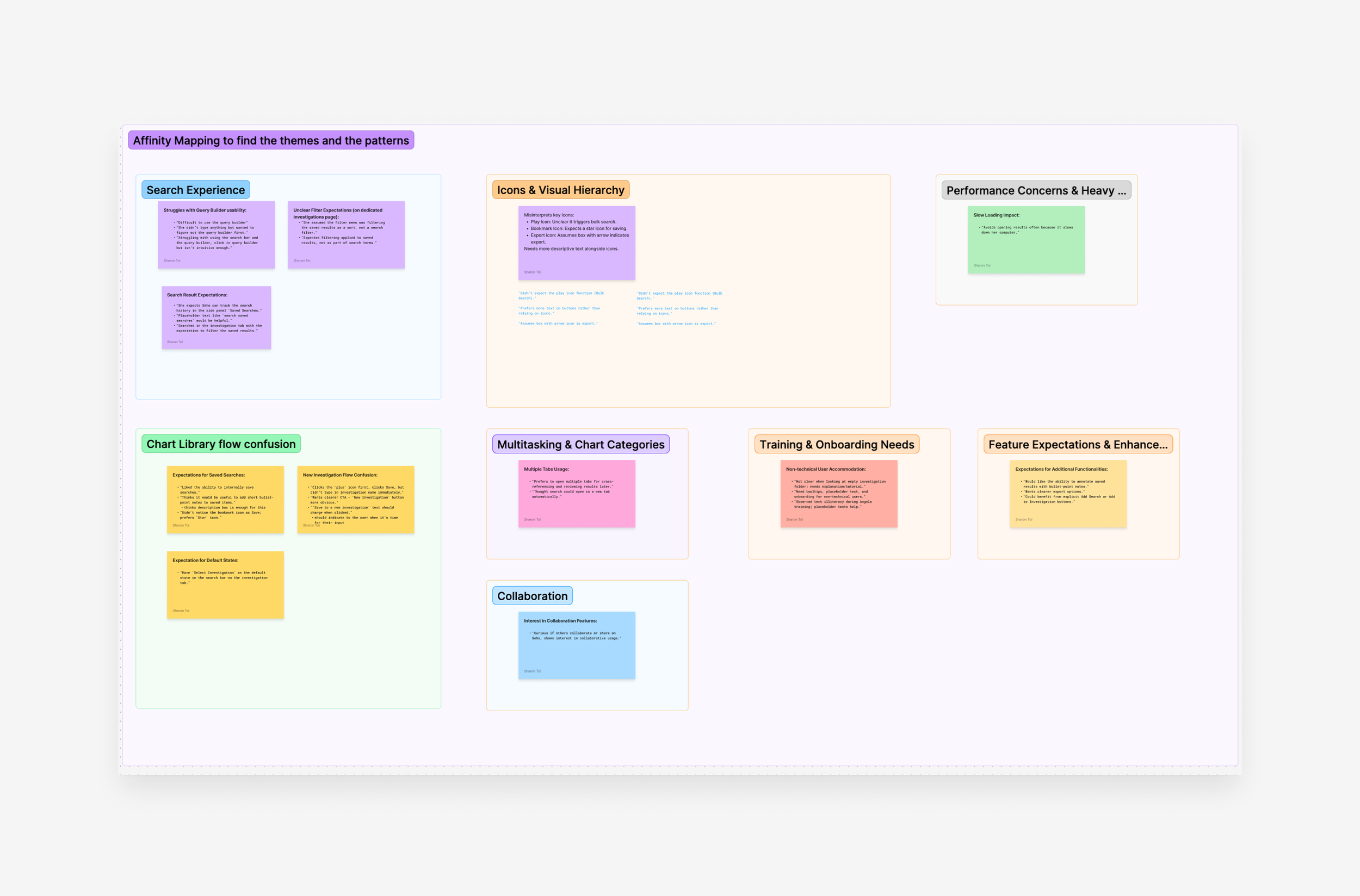
Step 1
Affinity Mapping to find the themes and the patterns
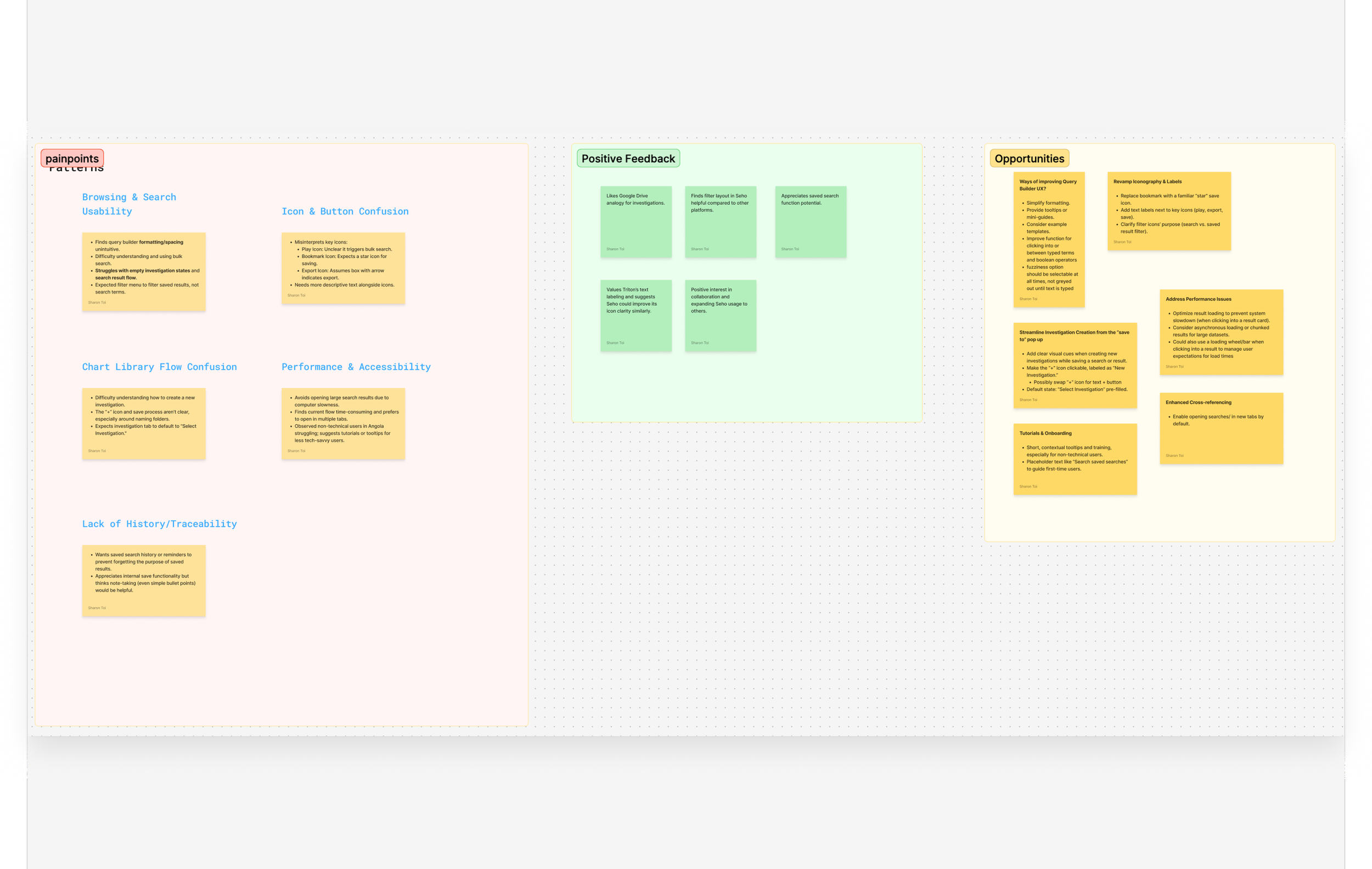
Step 2
User synthesis highlights the pain points, key insights, and
potential opportunities
Uncovering the Core Problem
Why was a powerful tool so invisible?
Financial advisors work in high-pressure, fast-moving markets. They need to interpret data quickly and communicate it clearly to clients. Yet the existing Chart Library required 4–5 clicks to reach, offered tiny previews, and gave no obvious path for discovery.
The issue wasn’t just visibility, it was misalignment between the system and how advisors think, evaluate options, and turn data into narratives. The challenge became a systems-level one: visibility, relevance, and trust.
What advisors said
I interviewed six advisors across different experience levels and mapped their workflows. It became clear we didn’t just need a cleaner UI we needed an experience that guided exploration and inspired creation.
Target Users
Exploratory (new user): they needed orientation, curation, categories, and visual cues.
Purposeful (experienced user): they were seeking direct, efficient access to charts, and they need precision.
This leads to a Perspective Shift. The old bottom-up flow (browse → select → preview) served only experts. We flipped the system to a top-down, topic-first entry, inviting exploration from the first click.

Exploratory User
Driven factors: Orientation, curation, categoris, visual cues
Purposeful User
Driven factors: Direct, efficiency, precision
Research: Competitive analysis
I analyzed Google Drive, YCharts, and Morningstar to understand how they balance, discovery, scale, speed, evaluation. What emerged as universal principals below, became our design guardrails. The best tools feel fast because they remove decision friction.
Insight 1
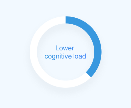
Topic-/collection-first entry lowers cognitive load

Insight 2
Persistent filters reduce rework
Insight 3
Live previews eliminate guesswork
Insight 4
Consistent labels build trust
Design Exploration
We explored multiple entry points and evaluated where the Chart Library should live. This decision was as much an organizational challenge as a UX one..
I proposed three directions:
A standalone tab
Embedding the CL directly on the homepage (chosen)
Merging it with “My Insights” for long-term consolidation
The existing bottom-up flow (browse → select → preview) primarily served expert users.
By embedding the Chart Library on the homepage, we were able to shift to a top-down, topic-first entry, inviting exploration from the first click and lowering the barrier for less experienced users.
The homepage placement proved to be the strategic win: it boosted discoverability, better matched advisor workflows, and set the stage for future integrations like recommendations and auto-tagging.
Below are the three approaches to entry-point exploration that we looked at as a team described on the text above.
Direction 1
Standalone tab
Step 1: Exploring the entry points
Direction 2
Embedding the CL directly on the homepage (chosen)
Direction 3
Merging it with “My Insights” for long-term consolidation
Step 2: Exploring layout options
At this stage, we explored several layout options. We tested seven early directions, varying grid, list, and carousel layouts, filter placement, persistent preview, multi-selection, and talking points. Here’s what we learned:
Dense grids → great for experts, overwhelming for new advisors
Preview-first → improved evaluation, weakened navigation
Multi-panel → balanced but cognitively heavy
Topic-first → best blend of orientation + speed
We narrowed to three options below:
Prototype #3
Fully reimagined system (highest potential, needed careful scoping)
Prototype #1
Light refresh (quick wins, low impact)
Prototype #2
Live preview redesign (better usability, harder onboarding)
Usability Testing
We tested Prototype 2, embedding the CL directly on the homepage, as it provided the best balance between usability impact and delivery constraints. Prototype 1 introduced minimal layout change and did not significantly improve discoverability, while Prototype 3 required a higher design and engineering scope than the timeline allowed for this release. Prototype 2 emerged as the optimal solution, balancing usability gains with delivery constraints. It supported key priorities:
Aligning with the business growth strategy
Reducing the learning curve for new and existing users
Designing a modular system that could evolve over time
Enabling a strategic platform move without over-engineering
We ran two rounds of testing: prototype testing with exploratory and purposeful users, followed by beta testing in staging and production environments. Feedback informed key refinements, including:
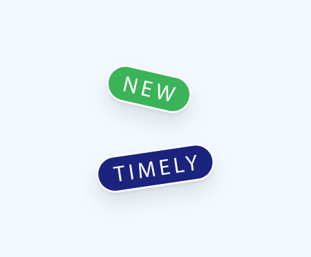
Default sorting changed to “Most used”, with persistent filter states
Added keyboard shortcuts and a persistent view toggle for experienced users
These iterations validated the decision to prioritize direct access to the CL and ensured the design reflected real-world advisor workflows.
Final Experience
We landed on a two-panel system with preview:
Key features:
Topic-first navigation for intuitive entry
Filters + toggleable views to match different workflows
Carousel-style previews for fast scanning of multiple charts
Create modal for one-click creation of articles, chartbooks, or videos
We deliberately avoided complexity creep, focusing on clarity, speed, and scalability.
Final prototype tested, selected for implementation
Reflection
This project reinforced that:
Curiosity reveals deeper problems than certainty
Big transformations often come from rethinking entry points, not just adding features
Designing for dual personas is less about compromise and more about orchestration
More than a UI refresh, this was a strategic repositioning of how advisors engage with insights — proof that clarity and structure build trust at every level of product design.