

Pratt Institute Libraries - Optimizing the Discovery Search Experience
ROLE:
UX Design Consultant
RESPONSIBILITIES:
User Research, Usability Testing, Interview, Insight Analysis & Reporting
UI Prototyping
TIMELINE:
6 weeks (2021)
TEAM:
4 UX Consultants
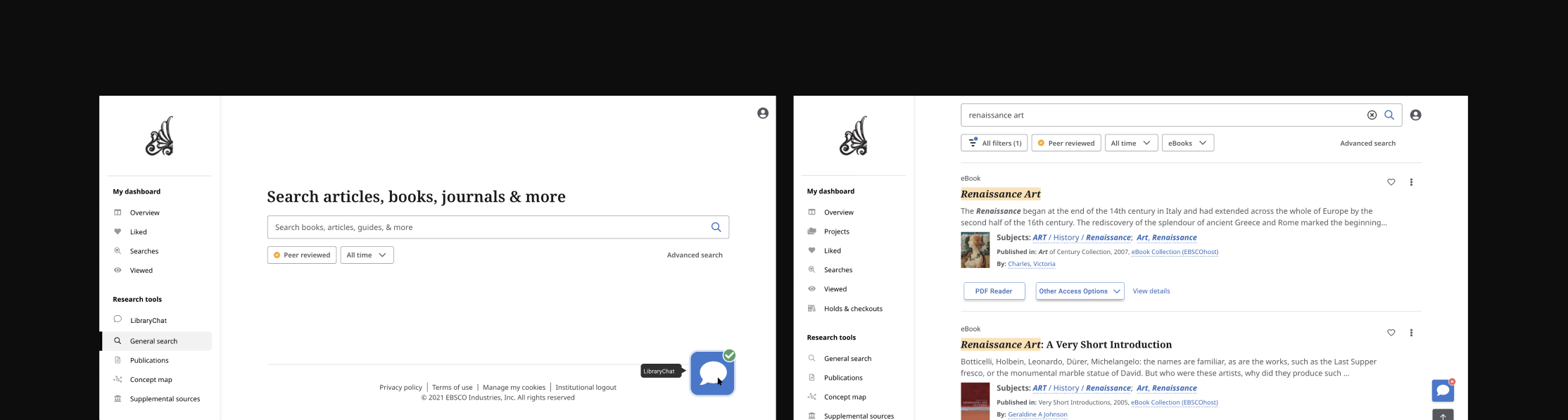
Pratt Institute Libraries was preparing to roll out a new EBSCO-based discovery interface intended to replace their existing search experience.
Because students rely on the library for coursework and research, any usability regression could significantly impact academic workflows. The Digital Team needed confidence that the new interface actually improved discoverability, clarity, and access to materials before full launch.
Challenge
While the new interface introduced modern UI patterns, the team lacked evidence that students could:
Find key support tools (e.g., Ask-a-Librarian)
Confidently access PDFs
Understand filters and content sources
The risk was launching a “visually improved” interface that still failed students during real research tasks.
Research
While collaborating closely with three other UX consultants and the Libraries’ Digital Team, I led the usability research and synthesis, with ownership over:
Research planning and task design
Moderated usability testing
Quantitative + qualitative analysis
Translating findings into design recommendations and prototypes
To evaluate real student behavior, we conducted 9 moderated remote usability tests with undergraduate students across majors and class years.
Each session focused on:
Realistic research tasks
Think-aloud feedback
Task success, difficulty, and time
System Usability Scale (SUS)
We validated the study through pilot testing and synthesized findings using a rainbow sheet to identify high-frequency issues.
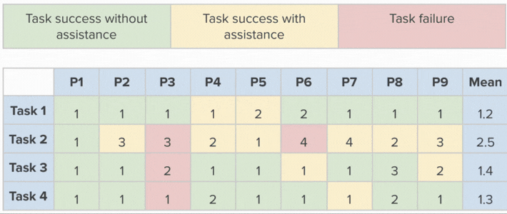
Task success, difficulty, and time


Rainbow sheet & Quotes

Sample of the test & SUS
Key Metrics
While the interface felt cleaner and more modern, critical moments in the research flow still caused confusion.
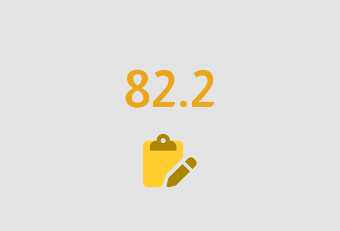
82.2 SUS score, indicating above-average usability
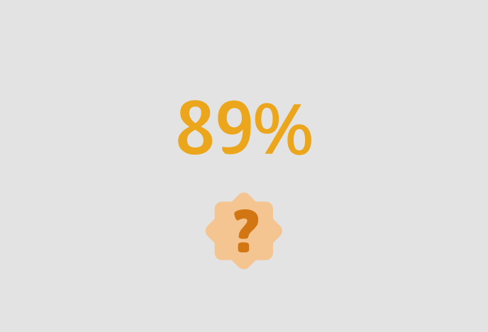
89% of participants required assistance on at least one task
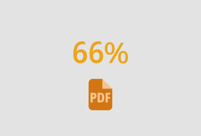
66% struggled to access PDFs
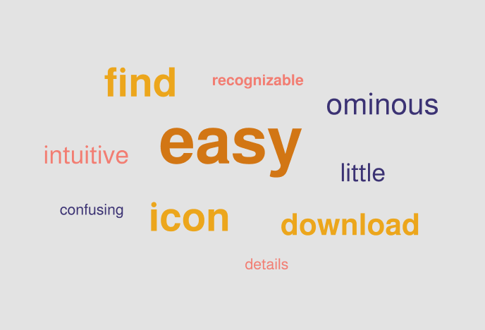
“Easy” was the most common word used to describe the interface
Key Findings
Students Missed Critical Support Tools
Although many students needed help during research, several failed to notice the Ask-a-Librarian chat. Its small size and placement made it easy to overlook, and some students searched for it in entirely different areas of the interface.
PDF Access Was Unclear and Error-Prone
Students frequently misunderstood the “Access now” submenu and struggled to locate the PDF reader. Several attempted multiple paths before successfully opening a document, breaking research momentum.
Internal vs. External Sources Were Confusing
Students had difficulty identifying whether materials were hosted within Pratt’s collection or linked externally. This caused unnecessary navigation and uncertainty when accessing content.
Filters Lacked Clarity
While nearly half of participants used filters, many were unsure about the meaning of certain categories (e.g., “Publisher” vs. “Publication”), leading to trial-and-error behavior rather than confident refinement.
Design Recomendations
Based on the most frequent and impactful usability issues, we proposed the following improvements:
Make Support Tools More Discoverable
Problem: Students missed the Ask-a-Librarian chat when they needed help.
Recommendation: Increase the visual prominence of the chat icon and add a secondary entry point in the left sidebar.
Impact: Students can quickly access help at moments of friction, reducing frustration and abandonment.
Simplify and Surface PDF Access
Problem: The PDF reader was hidden behind unclear navigation patterns.
Recommendation: Add a dedicated “PDF Reader” button directly on source cards and detail pages.
Impact: Faster access to content and a clearer mental model for how materials can be read.
Clarify Content Source Ownership
Problem: Students couldn’t tell whether a source was internal or external.
Recommendation: Add clear text labels on source cards indicating where the material is hosted.
Impact: Reduces confusion, improves trust, and streamlines the research process.
Improve Filter Comprehension
Problem: Ambiguous filter labels caused hesitation and misuse.
Recommendation: Add explanatory tooltips to filter categories.
Impact: Enables students to apply filters confidently and efficiently.
The Libraries’ Digital Team responded positively to the findings and design recommendations. Two proposals simplifying PDF access and improving filter clarity were prioritized for implementation in a planned Summer 2022 update.
The work helped the team move forward with greater confidence that the new interface supported real student workflows rather than just visual improvements.
Reflections
This project reinforced that:
High usability scores can still mask meaningful friction
Quantitative metrics reveal where problems exist
Qualitative insights explain why they matter
Combining both allowed us to move from surface-level feedback to concrete, defensible design decisions.
Final Design
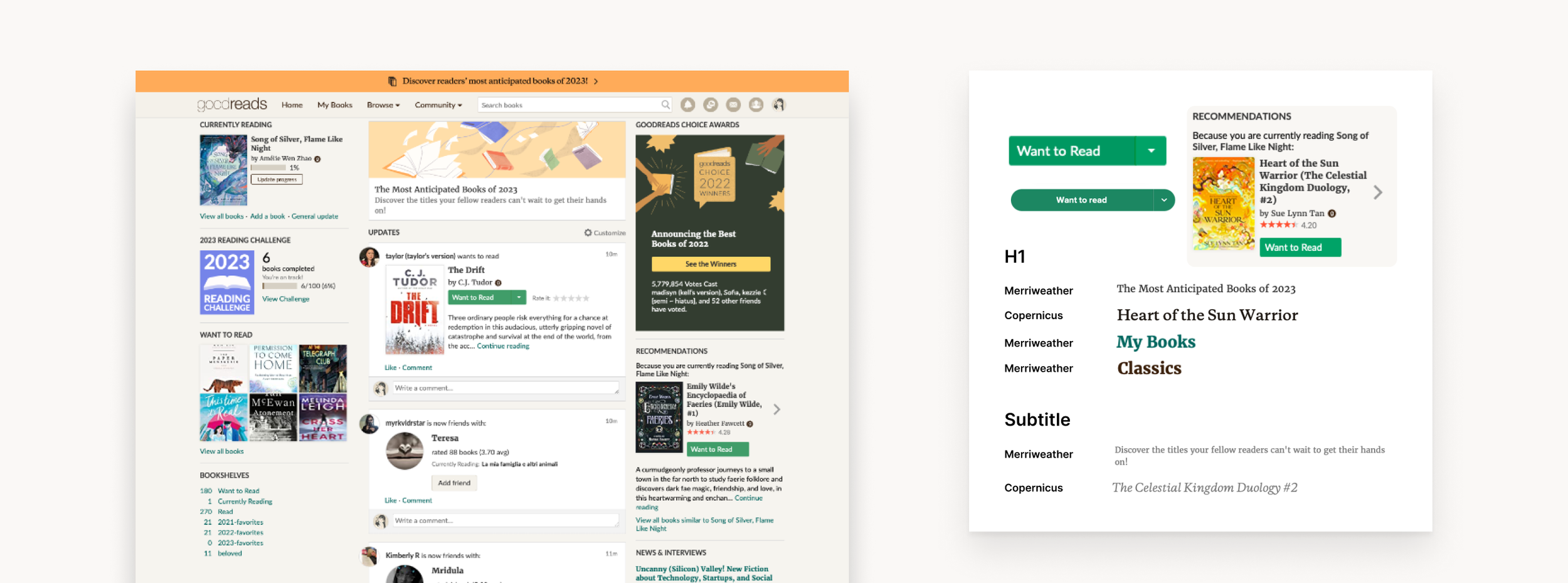
Description